Planning Your Dashboard Structure for Different User Roles
Overview
When building a mindzie Studio project, one of the most important strategic decisions you'll make is how to organize your dashboards for different user personas and business functions. Rather than jumping straight into creating metrics and KPIs, taking time upfront to plan your dashboard structure creates a more intuitive, user-friendly experience and makes your project easier to maintain and expand over time.
This guide presents a best practice approach: working front-to-back. This means building your dashboard structure first—creating empty dashboards organized by user role—before populating them with metrics and analysis. This strategic framework ensures your mindzie Studio implementation aligns with how your organization actually works and how different stakeholders need to consume process intelligence.
Why Plan Dashboard Structure First?
Planning your dashboard structure before creating analysis provides several key benefits:
- User-centric organization: Dashboards aligned with specific roles ensure users see only the metrics relevant to their responsibilities
- Clearer project scope: Understanding what dashboards you need helps define what analysis and enrichments to create
- Easier navigation: A well-structured dashboard hierarchy makes it simple for end users to find the information they need
- Better maintainability: Organized structure makes it easier for analysts to understand and update the project later
- Scalability: Starting with a solid framework allows you to add new metrics systematically without creating clutter
The Front-to-Back Approach
The front-to-back methodology works like this:
- Plan dashboard structure - Identify user roles and create empty dashboards
- Create investigations - Build investigation folders that align with dashboard names
- Build enrichments - Add data enrichments needed for your planned metrics
- Create analysis - Build metrics using filters and calculators
- Publish to dashboards - Populate your pre-planned dashboards with completed metrics
This approach contrasts with starting in the data and enrichments, then figuring out where to publish later. By planning the end result first, every step has clear purpose and direction.
Understanding Dashboard Types in mindzie Studio
Global Dashboards vs. Local Dashboards
mindzie Studio uses two types of dashboards:
- Global dashboards: User-facing dashboards accessible from the main Dashboards menu. These are what end users consume and interact with.
- Local dashboards: Analysis-specific dashboards contained within investigation notebooks. These provide detailed views when users drill into metrics.
This guide focuses on planning global dashboards for end users, though the same role-based thinking applies to organizing local dashboards within your analysis notebooks.
Framework for Role-Based Dashboard Structure
Common User Roles and Dashboard Types
While every organization is different, most process mining projects benefit from organizing dashboards around these common roles and functions:
1. Setup/Information Dashboard
Purpose: Provides project documentation and guidance for all users
Typical audience: Everyone—analysts, administrators, and end users
Content examples:
- Project overview and objectives
- Key metrics being tracked
- Data sources and refresh schedules
- Dashboard navigation guide
- Contact information for support
Best practice: Make this informational only—disable the copilot feature since users won't be performing analysis here.
2. Executive/Process Overview Dashboard
Purpose: High-level KPIs and strategic metrics
Typical audience: Executives, senior management, process owners
Content examples:
- Overall process performance summary
- Key performance indicators (cycle time, volume, cost)
- Trend analysis over time
- High-level conformance and compliance metrics
- Strategic improvement opportunities
3. Operations Dashboard
Purpose: Operational metrics for day-to-day process management
Typical audience: Operations managers, process managers, team leads
Content examples:
- Current workload and case volumes
- Active bottlenecks and delays
- Resource utilization
- Performance against targets
- Operational exceptions requiring attention
4. Compliance and Risk Dashboard
Purpose: Conformance, audit, and risk metrics
Typical audience: Compliance officers, auditors, risk managers
Content examples:
- Conformance rule violations
- Missing approval steps
- Segregation of duties issues
- Audit trail exceptions
- Risk indicators and trends
5. Branch/Department/Regional Dashboard
Purpose: Location-specific or department-specific performance
Typical audience: Branch managers, department heads, regional managers
Content examples:
- Performance metrics filtered by location/department
- Comparative analysis against other branches
- Local variations and exceptions
- Team-specific resource metrics
6. Process Improvement Dashboard
Purpose: Detailed analysis for continuous improvement initiatives
Typical audience: Process improvement teams, business analysts, Six Sigma practitioners
Content examples:
- Root cause analysis
- Variant analysis and process discovery
- Detailed performance breakdowns
- Cost analysis and waste identification
- Improvement opportunity identification
Step-by-Step: Creating Your Dashboard Structure
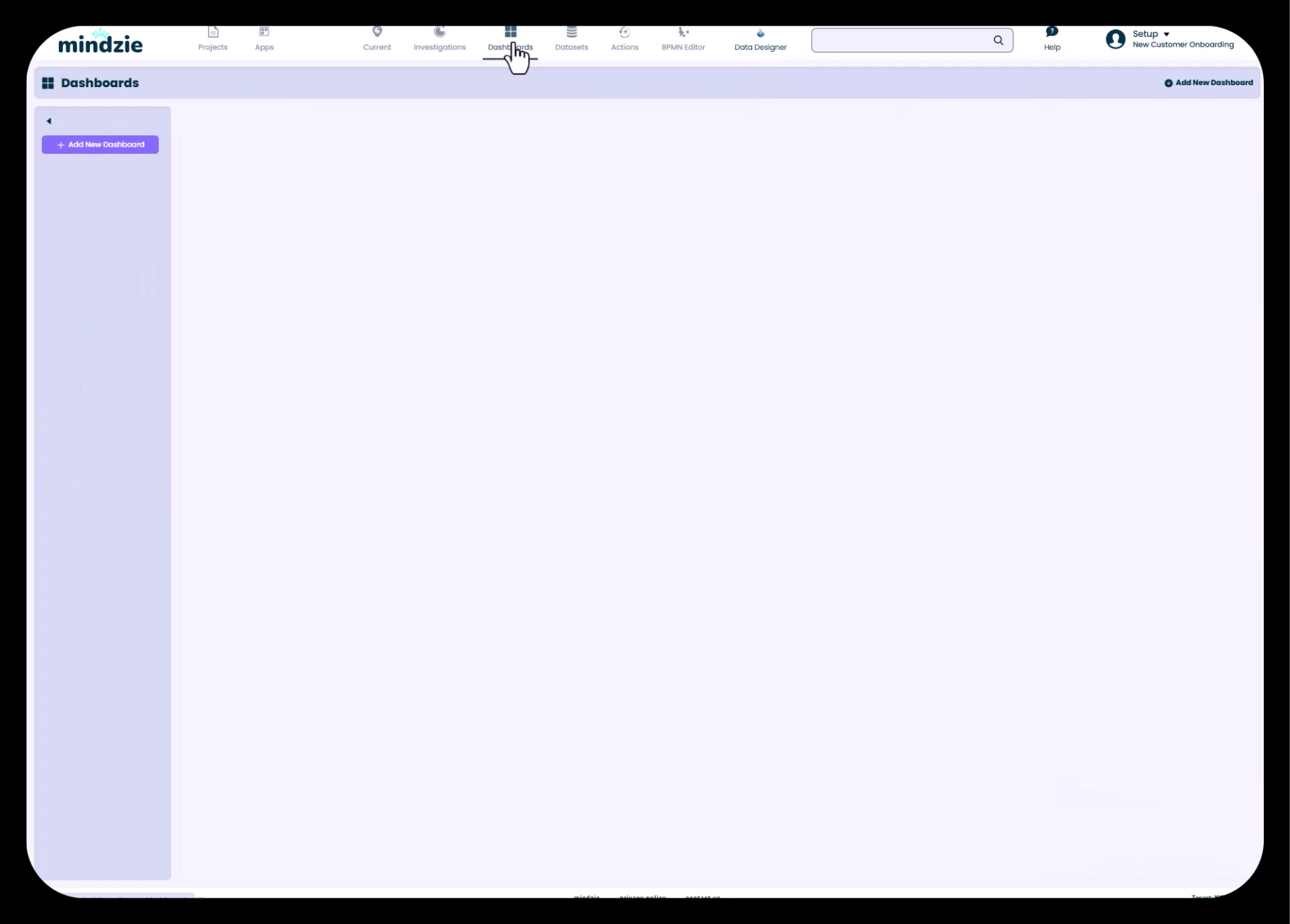
Step 1: Access the Dashboards Section
- In mindzie Studio, click the Dashboards button in the top navigation menu
- You'll see the empty dashboards area with an Add New Dashboard button
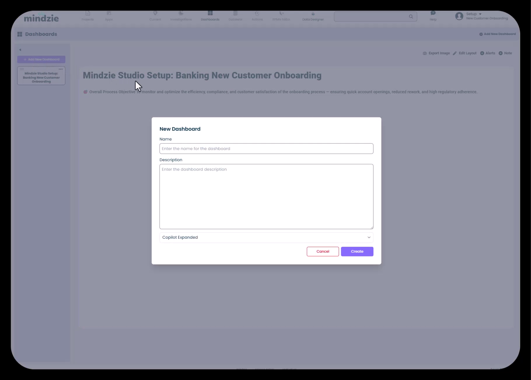
Step 2: Create Your Setup Dashboard
Start by creating an informational dashboard that provides context and guidance:
- Click Add New Dashboard
- Enter a descriptive name (e.g., "mindzie Studio Setup: Banking New Customer Onboarding")
- Add a description if desired
- Set Copilot to Collapsed since this is informational only
- Click Create
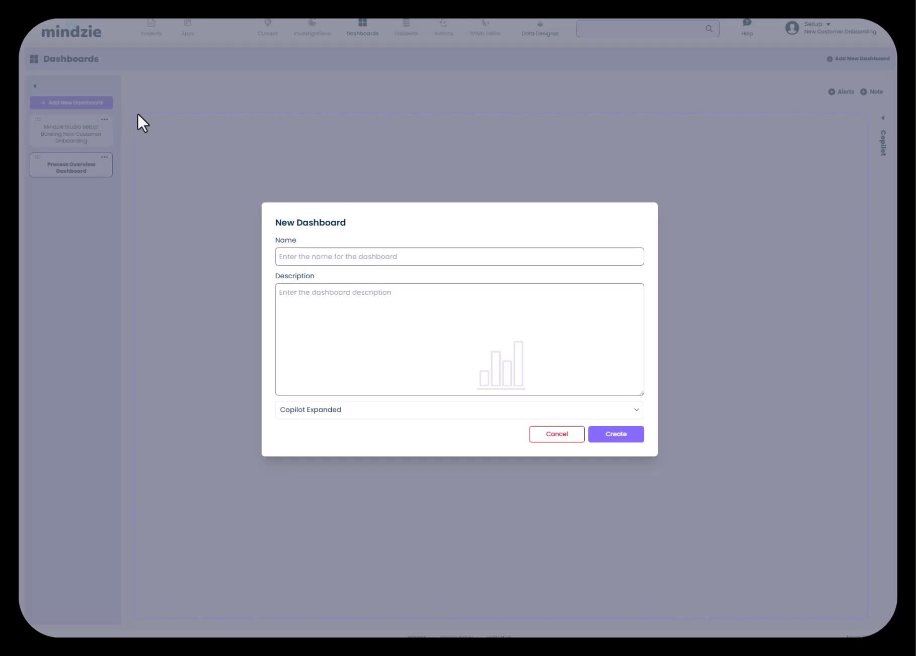
The setup dashboard is your opportunity to provide users with project context, navigation guidance, and documentation right within mindzie Studio.
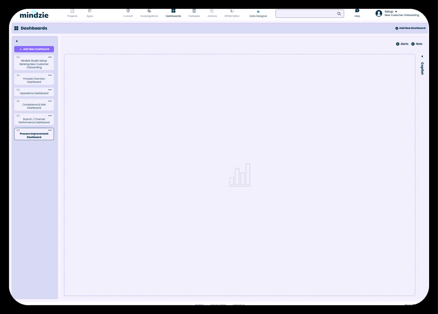
Step 3: Create Role-Based Dashboards
Continue creating dashboards for each user role you've identified:
- Click Add New Dashboard for each role
- Use clear, role-specific naming:
- "Process Overview Dashboard" (for executives)
- "Operations Dashboard"
- "Compliance & Risk Dashboard"
- "Branch / Channel Performance Dashboard"
- "Process Improvement Dashboard"
- Add brief descriptions explaining the dashboard's purpose
- Consider setting Copilot to Collapsed for simpler end-user experience
- Click Create for each dashboard
Best practice: At this stage, you're creating empty containers. Don't worry about populating them yet—that comes later in the workflow.
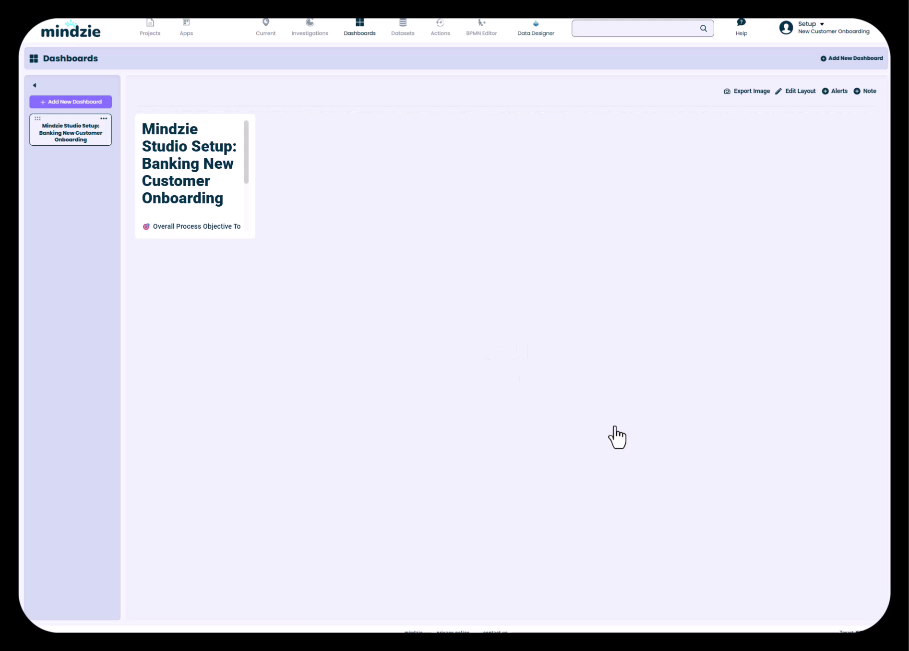
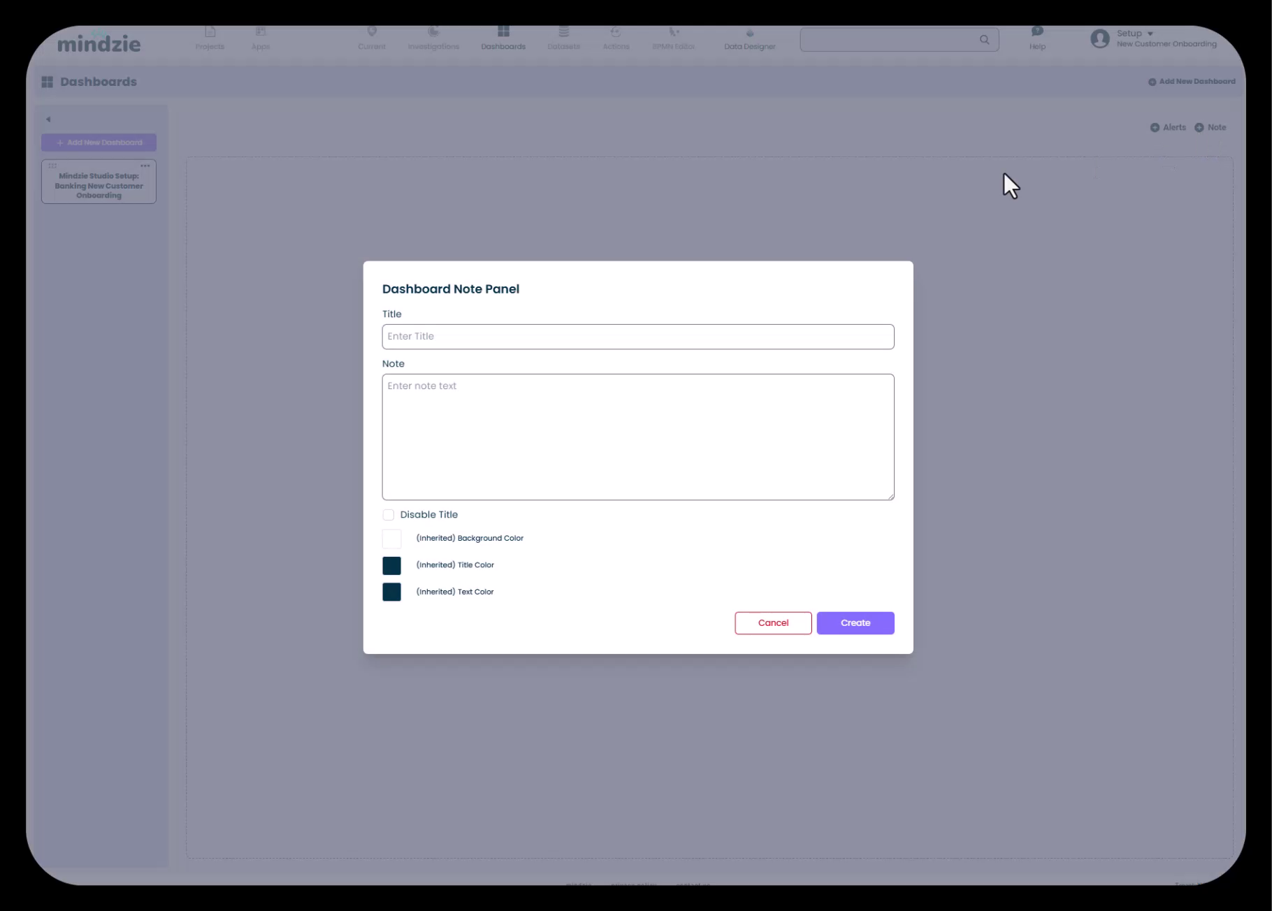
Step 4: Add Context to Your Setup Dashboard
Your setup dashboard should provide guidance for all users. Here's how to make it informative:
- Click into your Setup dashboard
- Click Note to add a note panel
- Use markdown formatting to structure your content:
- Use
#for headers - Use
-for bullet lists - Use
**text**for bold emphasis
- Use
- Consider disabling the title for a cleaner look
- Add key information:
- Project objectives
- List of available dashboards and their purposes
- Data information (date ranges, case counts, refresh schedule)
- Key metrics being tracked
- Navigation instructions
Step 5: Format Your Setup Dashboard Layout
Make your setup dashboard visually appealing:
- Click Edit Layout in the top toolbar
- Resize the note panel to fill the screen or span the full width
- Adjust panel positioning for optimal readability
- Click Finish to save the layout
Step 6: Align Investigation Structure with Dashboards
After creating your dashboard structure, create investigation folders that correspond to each dashboard:
- Navigate to Investigations
- Create investigations with names matching your dashboards
- This alignment makes it easy to remember where analysis belongs
For example:
- Investigation: "Process Overview Dashboard" → publishes to → Dashboard: "Process Overview Dashboard"
- Investigation: "Operations Dashboard" → publishes to → Dashboard: "Operations Dashboard"
This naming consistency creates a clear, logical project structure.
Dashboard Naming Best Practices
Be Descriptive and Role-Specific
Good dashboard names immediately communicate purpose and audience:
- Good: "Executive Process Overview"
- Better: "Process Overview Dashboard - Executive KPIs"
- Good: "Branch Performance"
- Better: "Branch / Channel Performance Dashboard"
Maintain Consistent Naming Conventions
Choose a naming pattern and stick to it:
- Option 1: "[Role] Dashboard" (e.g., "Operations Dashboard", "Compliance Dashboard")
- Option 2: "[Function] - [Detail]" (e.g., "Process Overview - Executive Summary")
- Option 3: "[Process] [Role] Dashboard" (e.g., "Customer Onboarding Operations Dashboard")
Use Names That Scale
Consider how your naming will work as the project grows:
- If you might add multiple processes, include the process name in dashboard titles
- If you might expand to multiple regions, consider including geographic scope
- Leave room in your structure for future additions
Using the Copilot Feature Strategically
Each dashboard in mindzie Studio includes an optional AI copilot assistant. You can configure this in three states:
- Expanded: Copilot panel is visible by default
- Collapsed: Copilot is available but minimized (recommended for most end users)
- Disabled: Copilot is not available (best for informational-only dashboards)
Best practice: For end-user dashboards, set the copilot to Collapsed. This keeps the interface clean and simple while still providing AI assistance if users need it. Only use Expanded for power users who will regularly leverage AI insights.
Working with Note Panels and Markdown
Note panels are valuable for adding context and instructions throughout your dashboards. mindzie Studio supports markdown formatting, allowing you to create well-structured documentation:
Common Markdown Syntax
# Header 1
## Header 2

**Bold text**
*Italic text*

- Bullet point 1
- Bullet point 2

1. Numbered item 1
2. Numbered item 2

[Link text](URL)
Note Panel Best Practices
- Disable titles for cleaner, more integrated note panels
- Use background colors to visually distinguish informational sections (dark backgrounds with light text can create emphasis)
- Add hover instructions to help users understand how to interact with metrics
- Include drill-down guidance to explain that users can click panels for more detail
Example Dashboard Structures by Industry
Banking Customer Onboarding
- mindzie Studio Setup - Banking Customer Onboarding (informational)
- Process Overview Dashboard (executive summary)
- Operations Dashboard (onboarding managers)
- Compliance & Risk Dashboard (compliance team)
- Branch Performance Dashboard (branch managers)
- Process Improvement Dashboard (analysts)
Insurance Claims Processing
- Claims Processing Setup & Guide (informational)
- Executive Summary Dashboard (leadership)
- Claims Operations Dashboard (claims managers)
- Adjuster Performance Dashboard (team leads)
- Compliance & Audit Dashboard (compliance)
- Process Analytics Dashboard (improvement team)
Healthcare Patient Flow
- Patient Flow Overview & Setup (informational)
- Executive Quality Metrics (hospital administration)
- Department Operations Dashboard (department managers)
- Clinical Compliance Dashboard (quality assurance)
- ED/Admission Performance Dashboard (emergency/admissions)
- Process Optimization Dashboard (operational excellence)
Common Pitfalls to Avoid
Creating Too Many Dashboards
Problem: Every possible metric gets its own dashboard, creating a confusing navigation structure.
Solution: Group related metrics on single dashboards organized by role. Most projects need 4-7 global dashboards.
Creating Too Few Dashboards
Problem: Everything goes into one or two massive dashboards that try to serve everyone.
Solution: Separate concerns by role and function. Different users have different needs—respect that with targeted dashboards.
Inconsistent Naming
Problem: Dashboard names don't clearly indicate their purpose or audience.
Solution: Establish naming conventions upfront and document them in your setup dashboard.
Not Using a Setup Dashboard
Problem: Users don't understand what dashboards exist or how to navigate the project.
Solution: Always create an informational setup dashboard as your project's "home page."
Building Backwards
Problem: Creating lots of analysis first, then figuring out where to publish it later, resulting in disorganized dashboards.
Solution: Plan your dashboard structure first, then build analysis with clear publication targets.
Next Steps
Once you've created your dashboard structure, you're ready to move to the next phases of project development:
- Create corresponding investigations - Build investigation folders aligned with your dashboard names
- Build log enrichments - Add performance metrics, conformance rules, and other enrichments to enhance your data
- Create analysis - Build metrics using filters and calculators within your investigations
- Publish to dashboards - Add your completed metrics to the appropriate role-based dashboards
- Format and refine - Use note panels, layouts, and formatting to create polished, user-friendly dashboards
By starting with a well-planned dashboard structure, every subsequent step has clear direction and purpose. Your end users will benefit from intuitive navigation and role-appropriate metrics, while you'll maintain a project that's easy to understand, update, and expand.
Related Topics
- Working with Investigations and Analysis Notebooks - Learn how to create investigation folders and analysis notebooks aligned with your dashboard structure
- Publishing Metrics from Notebooks to Dashboards - Understand how to publish completed analysis to your planned dashboards
- Designing User-Friendly Dashboards with Notes and Formatting - Advanced techniques for creating professional, polished dashboards
- Understanding Drill-Down and Continuous Monitoring - How dashboard structure supports both discovery and ongoing monitoring use cases