Designing User-Friendly Dashboards with Notes and Formatting
Overview
Creating effective dashboards in mindzie Studio goes beyond simply displaying metrics. Professional, user-friendly dashboards combine visual appeal with functional information delivery, helping end users understand not just what the metrics show, but how to interact with them and what actions to take.
This guide covers best practices for designing dashboards that balance aesthetics with usability, using markdown formatting, note panels, color schemes, and thoughtful layout design to create intuitive user experiences.
Why Dashboard Design Matters
Well-designed dashboards serve multiple purposes:
- Guide users through complex data with clear instructions
- Provide context for metrics and KPIs
- Enhance usability by explaining drill-down capabilities and interactions
- Maintain visual appeal while delivering dense information
- Support different user roles with targeted guidance and explanations
- Enable self-service analytics by empowering users to explore data independently
Using Note Panels for Dashboard Instructions
Note panels are one of the most powerful tools for creating user-friendly dashboards. They allow you to add contextual information, instructions, and explanations directly within your dashboard layout.
Creating a Note Panel
When building or editing a dashboard layout, you can add note panels to provide information to users:
- Click Edit Layout on your dashboard
- Click Note to add a new note panel
- Configure the note panel properties
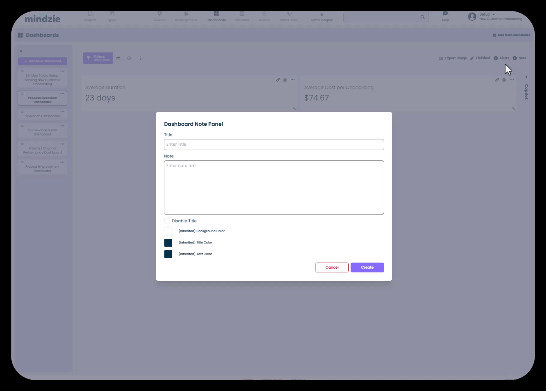
Note Panel Configuration Options
The Dashboard Note Panel dialog provides several customization options:
- Title: Add a descriptive title for the note panel
- Note: Enter your content using markdown formatting
- Disable Title: Check this option to hide the title and display only the note content (useful for full-width informational banners)
- Background Color: Choose a background color to make the note stand out
- Title Color: Customize the title text color
- Text Color: Set the color for the main note text
Common Use Cases for Note Panels
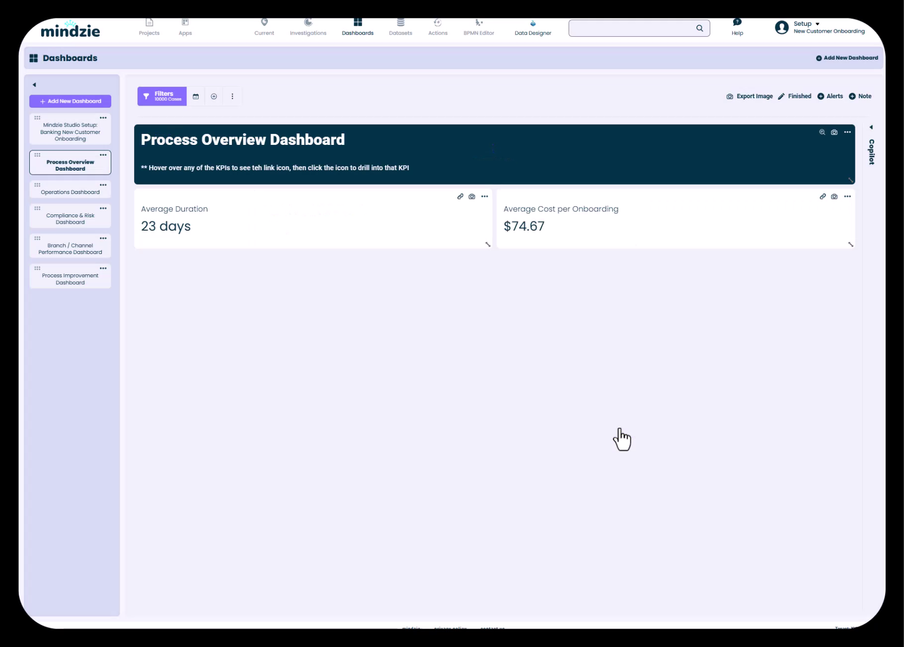
Dashboard Instructions Add a prominent note panel at the top of dashboards to explain how users should interact with the metrics:
## Process Overview Dashboard

** Hover over any of the KPIs to see the link icon, then click the icon to drill into that KPI
Process Context Provide background information about the process being analyzed, helping users understand the business objectives and what they should be monitoring.
Guidance for Analysts If you're a process analyst building multiple investigations and KPIs, use note panels to document what you've done, why specific metrics were chosen, and any important considerations for future updates.
Leveraging Markdown for Text Formatting
mindzie Studio supports markdown language in note panels, enabling rich text formatting to enhance readability and visual hierarchy.
Markdown Formatting Capabilities
Headers Use markdown headers to create visual hierarchy:
# Main Title (H1)
## Section Header (H2)
### Subsection (H3)
Emphasis Add emphasis to important information:
*italic text*
**bold text**
*** bold and italic***
Lists Create organized lists for instructions or process steps:
- Bullet point item
- Another bullet point
  - Nested item

1. Numbered item
2. Another numbered item
Links and More Include hyperlinks, code blocks, and other markdown elements to create comprehensive dashboard documentation.
Working with Color Schemes
Color plays a critical role in dashboard design, helping to create visual hierarchy, draw attention to important information, and maintain consistency with your organization's branding.
Creating Dark Theme Note Panels
For high-impact informational panels:
- Set Background Color to a dark shade (such as dark blue or teal)
- Set Text Color to light or white for contrast
- Check Disable Title to create a seamless banner effect
- Maximize the panel across the screen width
This creates a professional header that clearly separates instructional content from analytical metrics.
Light Theme Panels
For less prominent notes or embedded guidance:
- Use lighter background colors
- Maintain dark text for readability
- Keep titles enabled to provide clear section labels
Color Consistency
Maintain visual consistency across your dashboard set:
- Use the same color scheme for similar types of information across all dashboards
- Apply consistent styling for instructions versus contextual notes
- Consider your end users' preferences and accessibility needs
Using Edit Layout to Arrange Dashboard Elements
The Edit Layout feature provides a flexible grid system for organizing dashboard components.
Layout Best Practices
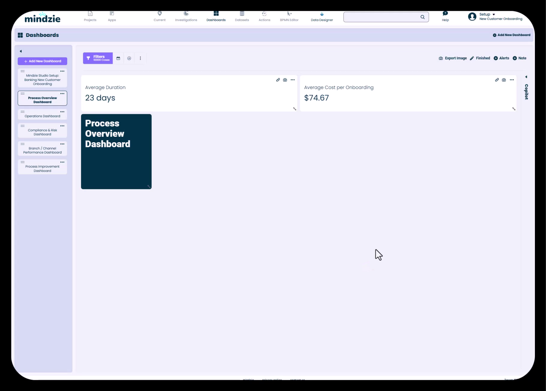
Full-Screen Information Panels For instructional note panels, maximize them across the full width of the dashboard. This creates clear separation between guidance and metrics.
Side-by-Side Metrics Arrange related KPIs side-by-side to enable easy comparison. You can place multiple metrics in a single row to maximize screen real estate.
Logical Flow Organize your dashboard from top to bottom:
- Instructional header or context panel
- Primary KPIs and high-level metrics
- Detailed breakdowns and supporting analysis
- Additional context or guidance as needed
Responsive Sizing Consider how your dashboard will appear on different screen sizes. mindzie Studio's grid system helps maintain readability across devices.
Adding Hover Instructions and Drill-In Guidance
One of mindzie Studio's most powerful features is the ability to drill down from dashboard metrics into the underlying analysis notebooks. However, users may not discover this capability without clear guidance.
Explaining Drill-Down Functionality
Use note panels to explicitly tell users how to drill down:
** Hover over any of the KPIs to see the link icon, then click the icon to drill into that KPI
This simple instruction helps users understand that dashboards are not static displays, but interactive tools for exploration.
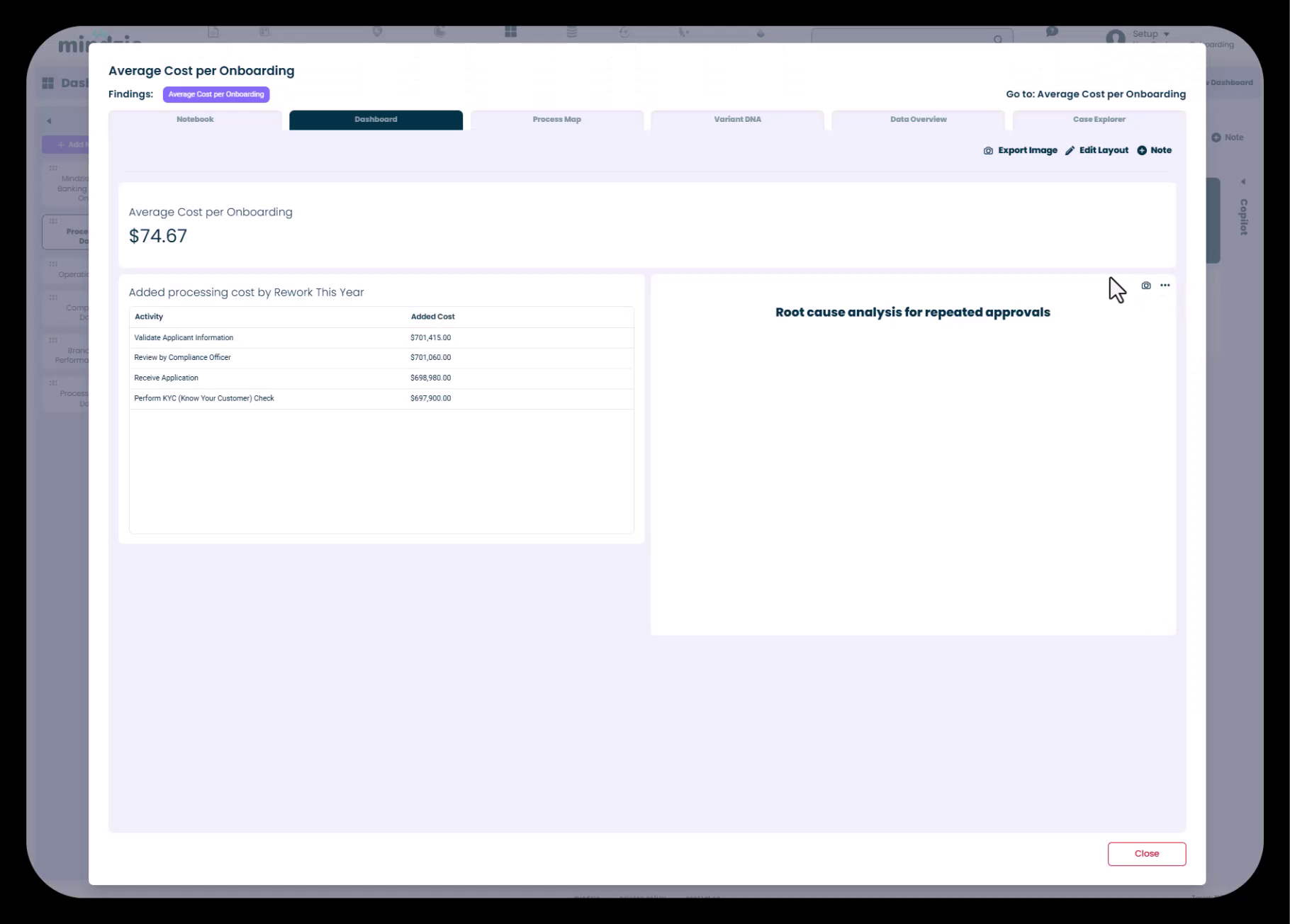
What Users See When They Drill Down
When users click the link icon on a dashboard metric, they access the full analysis notebook containing:
- The Dashboard tab showing the specific metric
- Process Map visualizations
- Variant DNA analysis
- Data Overview with detailed statistics
- Case Explorer for individual case examination
- AI Co-pilot for guided analysis
Guiding Users Through the Notebook
You can also add note calculators within analysis notebooks themselves to explain:
- What the analysis is measuring
- Why it matters to the business
- How to interpret the results
- What actions to take based on the findings
Balancing Visual Appeal with Information Density
Effective dashboard design requires finding the right balance between aesthetics and information delivery.
Avoiding Information Overload
Start with Key Metrics Don't try to display everything on a single dashboard. Focus on the most important KPIs for each user role or business function.
Use Progressive Disclosure Present high-level summaries on dashboards, with drill-down capabilities providing access to detailed analysis.
White Space Matters Don't crowd every inch of the dashboard. Strategic use of white space improves readability and reduces cognitive load.
Creating Visual Interest
Vary Panel Sizes Not all metrics need the same amount of space. Size panels according to the complexity and importance of the information.
Use Color Strategically Apply color to draw attention to key information, but avoid creating a "rainbow effect" with too many competing colors.
Consistent Styling Apply consistent formatting, fonts, and colors to create a polished, professional appearance.
Dashboard Structure for Different User Roles
When creating dashboard sets for an organization, consider designing role-specific views with appropriate formatting and guidance.
Executive Dashboards
- Minimal text, maximum visual impact
- High-level KPIs prominently displayed
- Brief context notes explaining business objectives
- Clean, uncluttered layouts
Operations Dashboards
- Detailed metrics with breakdowns
- Instructions for common operational tasks
- Links to related dashboards for different process areas
- Time-based trending information
Process Improvement Dashboards
- Extensive use of note panels to document analysis approach
- Detailed drill-down guidance
- Context about process baselines and improvement targets
- Instructions for interpreting root cause analysis
Compliance Dashboards
- Clear explanations of conformance rules
- Instructions for investigating violations
- Context about regulatory requirements
- Guidance on remediation steps
Step-by-Step: Creating a Formatted Dashboard
Let's walk through creating a professional dashboard with formatted notes and metrics.
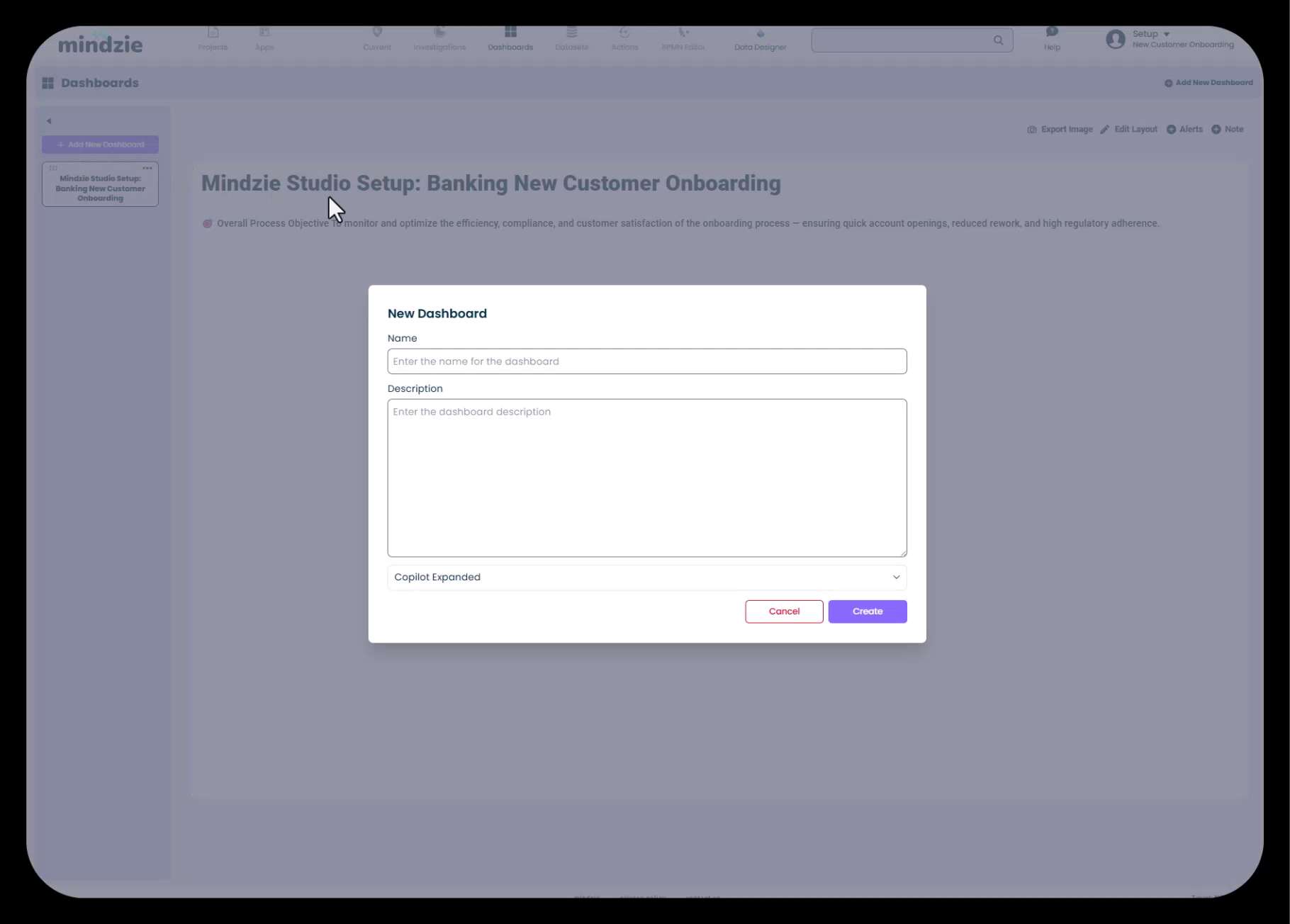
Step 1: Create the Dashboard Structure
- Navigate to Dashboards in mindzie Studio
- Click Add New Dashboard
- Enter a descriptive name (e.g., "Process Overview Dashboard")
- Optionally add a description
- Click Create
Step 2: Add Metrics to the Dashboard
Before focusing on formatting, publish your key metrics from analysis notebooks to the dashboard:
- Open your analysis notebook
- Click the three-dot menu on a calculator
- Select Publish to Dashboard
- Choose your target dashboard
Step 3: Add an Instructional Note Panel
- Click Edit Layout on your dashboard
- Click Note to add a note panel
- Configure the note:
- Disable Title: Check this box
- Background Color: Select a dark color (e.g., dark teal)
- Text Color: Select white or light color
- Note: Enter your markdown content:
## Process Overview Dashboard ** Hover over any of the KPIs to see the link icon, then click the icon to drill into that KPI - Click Create
Step 4: Arrange the Layout
- Drag the note panel to the top of the dashboard
- Maximize it across the full width
- Arrange your metrics below, placing related KPIs side-by-side
- Adjust panel sizes to create visual balance
Step 5: Review and Refine
- Exit edit mode to see the dashboard as users will see it
- Test the drill-down functionality
- Review the visual hierarchy and readability
- Make adjustments as needed
Tips and Best Practices
For Dashboard Designers
- Work front-to-back: Plan your dashboard structure before populating it with metrics
- Document as you build: Use note panels to capture decisions and rationale while they're fresh
- Test with real users: Get feedback from actual dashboard consumers before finalizing
- Iterate based on usage: Monitor which dashboards and metrics get used most, and refine accordingly
For Note Panel Content
- Be concise: Users skim dashboards; keep instructions brief and actionable
- Use active voice: "Click the icon to drill in" rather than "The icon can be clicked for drilling in"
- Provide examples: When explaining complex interactions, give specific examples
- Update regularly: Keep dashboard instructions current as features and workflows evolve
For Visual Design
- Maintain consistency: Use the same formatting patterns across all dashboards in a project
- Consider accessibility: Ensure sufficient color contrast for users with visual impairments
- Prioritize readability: If a design choice makes text harder to read, simplify
- Less is more: When in doubt, remove visual elements rather than adding them
For User Guidance
- Assume no prior knowledge: Many dashboard users may be new to process mining
- Explain the "why": Help users understand why metrics matter, not just what they show
- Enable self-service: Provide enough guidance that users can explore independently
- Link to resources: Reference additional documentation or help resources when appropriate
Common Pitfalls to Avoid
Too Much Text While note panels are valuable, avoid creating "wall of text" dashboards. Keep notes focused and concise.
Inconsistent Formatting Switching between different color schemes and styles across dashboards creates a disjointed user experience.
Missing Instructions Don't assume users will discover drill-down capabilities on their own. Explicitly explain how to interact with the dashboard.
Overcrowded Layouts Trying to fit too many metrics on a single dashboard reduces the impact of each individual KPI.
Ignoring Mobile Users If users access dashboards on tablets or smaller screens, ensure your layouts remain readable.
Static Design Thinking Remember that mindzie dashboards support drill-down and interaction. Design with these capabilities in mind.
Advanced Techniques
Markdown Templates
Create reusable markdown templates for common dashboard types:
Executive Dashboard Template
## [Process Name] Executive Overview

Key metrics for [process objective]. Updated [frequency].

** Hover over metrics to drill into detailed analysis
Operational Dashboard Template
## [Process Name] Operations Dashboard

Monitor daily performance and identify issues requiring attention.

**How to use this dashboard:**
- Review KPIs for current performance
- Click any metric to see detailed breakdowns
- Use filters to focus on specific regions/departments
Color Palette Consistency
Define a standard color palette for your organization:
- Primary instruction panels: Dark teal background, white text
- Warning notes: Amber background, dark text
- Success indicators: Green accent colors
- Neutral information: Light gray background, dark text
Document this palette and apply it consistently across all projects.
Progressive Dashboard Sets
Design dashboard sets that guide users from high-level to detailed views:
- Setup/Information Dashboard: Explains the project and how to navigate
- Executive Dashboard: High-level KPIs with minimal detail
- Operational Dashboards: Department or function-specific metrics
- Analytical Dashboards: Detailed breakdowns for process improvement teams
Each dashboard includes appropriate note panels guiding users to related dashboards.
Conclusion
Designing user-friendly dashboards in mindzie Studio requires thoughtful attention to both form and function. By leveraging note panels with markdown formatting, applying consistent color schemes, arranging layouts strategically, and providing clear user guidance, you can create dashboards that not only look professional but truly empower users to understand and act on process intelligence.
Remember that dashboard design is iterative. Start with clear structure and basic formatting, gather user feedback, and refine your approach over time. The most effective dashboards are those that evolve based on actual usage patterns and user needs.
Related Topics
- Planning Your Dashboard Structure for Different User Roles: Strategic guidance on organizing dashboards for different personas
- Publishing Metrics from Notebooks to Dashboards: How to move analysis into user-facing dashboards
- Understanding Drill-Down and Continuous Monitoring: Deep dive into dashboard interactivity
- Creating Analysis with Filters and Calculators: Building the metrics that populate your dashboards