End-to-End Project Build: Complete Workflow Summary
Overview
This comprehensive reference guide provides a complete roadmap for building a mindzie studio project from start to finish. Whether you're implementing process mining for customer onboarding, invoice processing, or any other business process, this workflow summary serves as your checklist and guide for creating production-ready process intelligence solutions.
mindzie studio enables organizations to transform raw process data into actionable insights through an eight-phase approach: project setup, data configuration, dashboard planning, log enrichment, analysis creation, metric building, dashboard publishing, and user experience optimization.
Complete Workflow at a Glance
The end-to-end workflow follows these eight distinct phases:
- Project Setup and User Configuration - Create the project framework and assign team members
- Data Upload and Column Mapping - Import process data and configure key fields
- Dashboard Structure Planning - Design the dashboard hierarchy for different user roles
- Log Enrichment - Enhance data with performance, conformance, and costing metrics
- Creating Investigations and Analysis Notebooks - Build analytical workspaces
- Building Metrics with Filters and Calculators - Create KPIs using low-code/no-code tools
- Publishing to Dashboards - Deploy metrics to local and global dashboards
- Formatting and User Experience Optimization - Polish dashboards for end-user consumption
Each phase builds upon the previous one, creating a comprehensive process intelligence solution that supports both discovery and continuous monitoring use cases.
Phase 1: Project Setup and User Configuration
Objectives
- Create a new mindzie studio project
- Configure project identification and branding
- Assign users with appropriate permissions
Step-by-Step Workflow
1. Create the Project
Log into mindzie studio and navigate to the Projects section. Click "Add New Project" to begin.
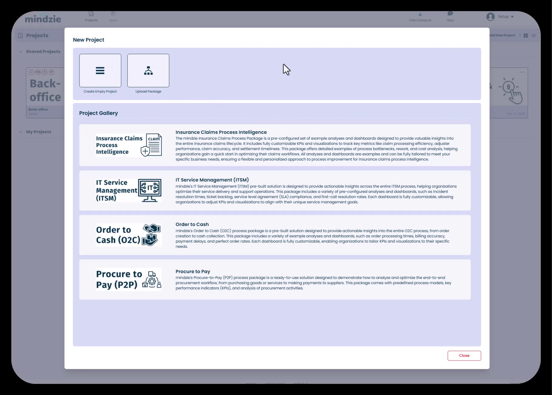
You'll be presented with three options:
- Create Empty Project - Start from scratch (recommended for custom implementations)
- Project Gallery - Use pre-built templates
- Upload Existing Package - Import a previously exported project
For most implementations, select "Create Empty Project" and provide a descriptive project name that reflects the business process being analyzed.
2. Upload Project Thumbnail
After creating the project, enhance its visual identification by uploading a custom thumbnail image. This is especially valuable when delivering projects to customers or managing multiple projects.
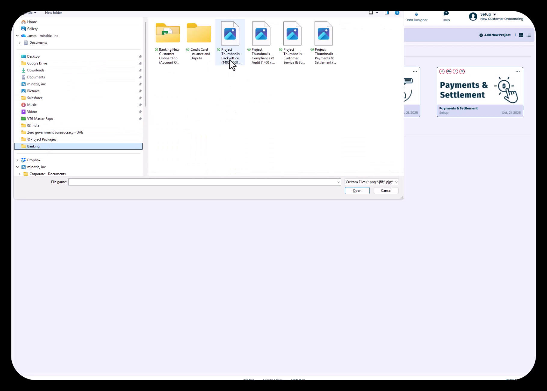
Click the three-dot menu on the project tile and select "Upload Thumbnail" to add a branded image that helps users quickly identify the project.
3. Assign Users and Configure Permissions
Click the three-dot menu again and select "Assign Users" to add team members to the project. mindzie studio supports two permission levels:
- Contributor - Can add analysis and create content but has limited administrative capabilities
- Owner - Full access to all project features including configuration, user management, and deletion
For collaborative project development, assign team members as Owners to enable full participation in the build process.
Best Practices
- Use clear, descriptive project names that indicate the business process and department
- Upload branded thumbnails for customer-facing projects
- Assign appropriate permissions based on user roles and responsibilities
- Consider creating separate projects for development and production environments
Common Pitfalls to Avoid
- Vague project names that don't clearly identify the process being analyzed
- Forgetting to assign key team members at the start of the project
- Assigning overly restrictive permissions that limit collaboration
Phase 2: Data Upload and Column Mapping
Objectives
- Import process event log data into mindzie studio
- Map columns to required process mining fields
- Validate data quality and format
Step-by-Step Workflow
1. Choose Data Import Method
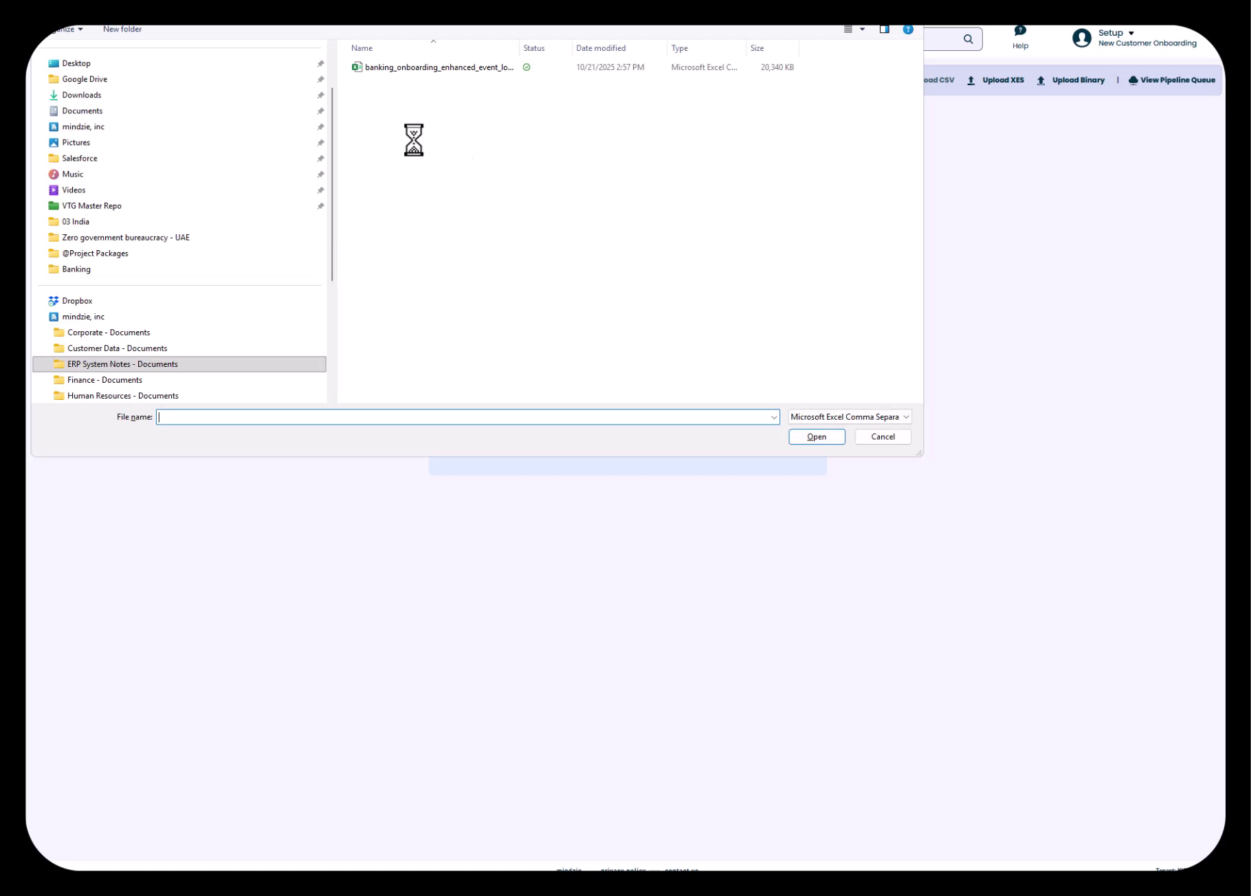
mindzie studio supports two primary data import methods:
- CSV Upload - Direct upload of comma-separated values files (ideal for one-time imports or small datasets)
- mindzie Data Designer - Connect to databases, data warehouses, and enterprise systems for automated data pipelines (recommended for production deployments)
For initial project setup or proof-of-concept work, CSV upload provides the fastest path to analysis.
2. Upload and Validate Data
Select your CSV file and upload it to mindzie studio. The system will analyze the file structure, detect encoding settings, and prepare the data for import. Review the preview to ensure data is being read correctly.
3. Map Key Columns
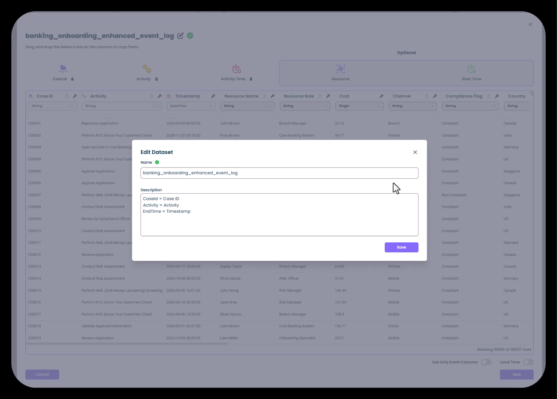
Use drag-and-drop to assign your data columns to mindzie's required fields:
- Case ID - Unique identifier for each process instance (e.g., customer ID, order number, claim number)
- Activity - The process step or event name (e.g., "Submit Application", "Approve Request")
- Timestamp - Date and time when the activity occurred
- Resource (Optional but Recommended) - Person, system, or department that performed the activity
mindzie studio automatically detects these fields when possible, but you can manually adjust assignments as needed.
4. Configure Additional Settings
For each column, you can:
- Change column types and data types
- Anonymize sensitive data for security compliance
- Adjust date/time formats
- Configure custom attributes
5. Import and Transform
Click "Next" to import the data. mindzie studio will transform your raw CSV into a structured event log, creating both an original dataset and an enriched dataset for analysis. Upon completion, you'll see summary statistics including the number of cases and events imported.
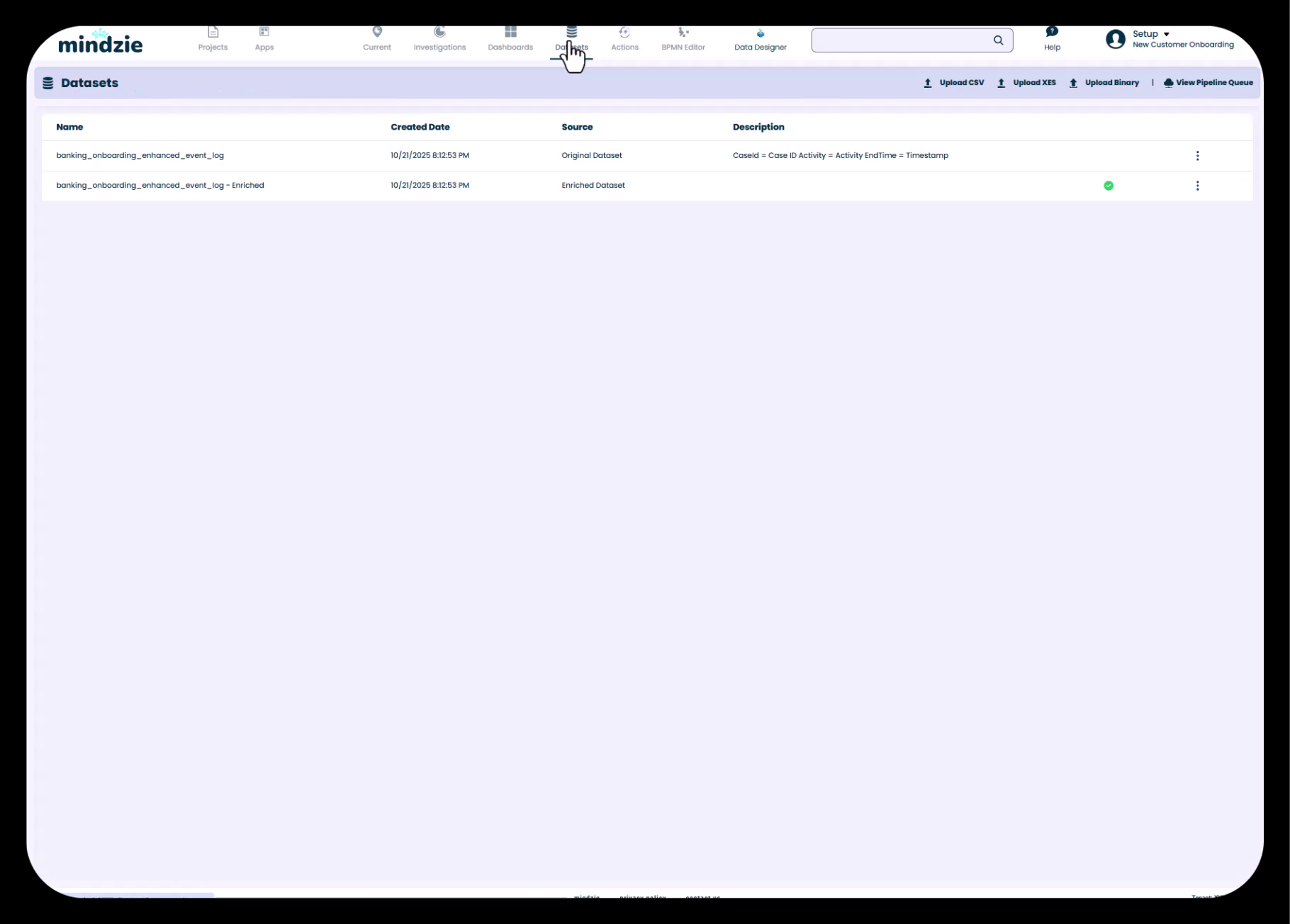
Understanding mindzie's Dual Dataset Architecture
After import, mindzie studio automatically creates two datasets:
- Original Dataset - The raw event log exactly as imported, preserved without modifications
- Enriched Dataset - An enhanced version created by the mindzie pipeline, containing calculated attributes, performance metrics, and additional insights
All analysis and dashboards should use the enriched dataset, as it contains the enhanced attributes created through log enrichment.
Default Analysis
mindzie studio automatically generates several starter analyses including:
- Process overview with key statistics
- Long case duration analysis
- Duration between main process steps
- Other foundational insights
These provide a quick-start foundation for exploring your process data.
Best Practices
- Ensure timestamps include both date and time components for accurate duration calculations
- Use consistent activity naming conventions in your source data
- Include resource information to enable workload and performance analysis by person/department
- Validate that Case IDs uniquely identify individual process instances
- Review the automatically generated analyses to understand your process quickly
Common Pitfalls to Avoid
- Importing data with inconsistent date formats that cause parsing errors
- Using Case IDs that don't uniquely identify process instances (e.g., using dates instead of unique identifiers)
- Missing timestamp information that prevents temporal analysis
- Forgetting to anonymize personally identifiable information when required
Phase 3: Dashboard Structure Planning
Objectives
- Design a dashboard hierarchy aligned with user roles and business needs
- Create informational setup documentation
- Establish the framework for metric organization
The Front-to-Back Approach
mindzie studio projects benefit from a "front-to-back" development methodology: build the dashboard structure first, then work backward to create the analysis and metrics that populate them. This ensures your end-user experience is well-planned before diving into detailed analysis.
Step-by-Step Workflow
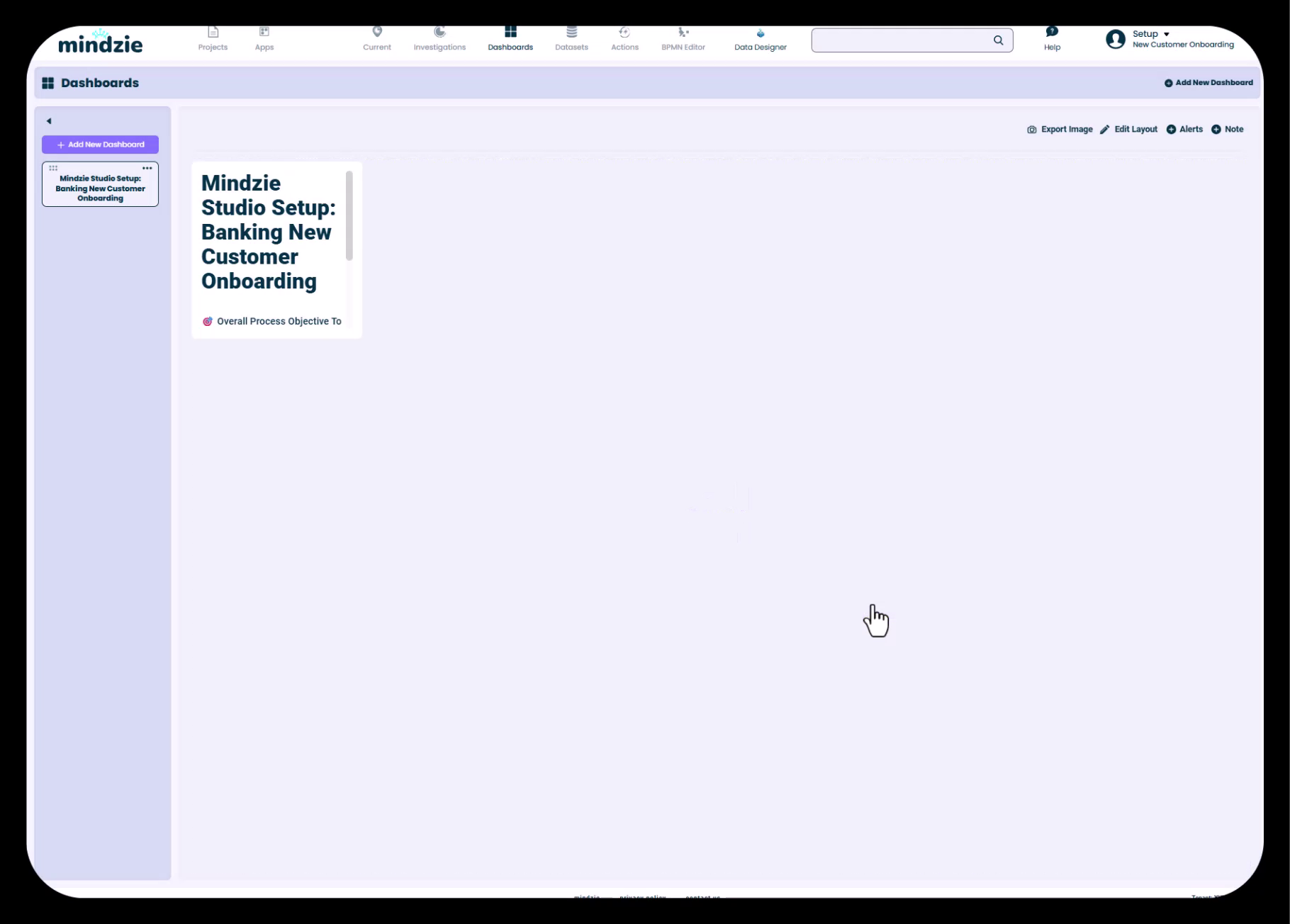
1. Create Setup Dashboard
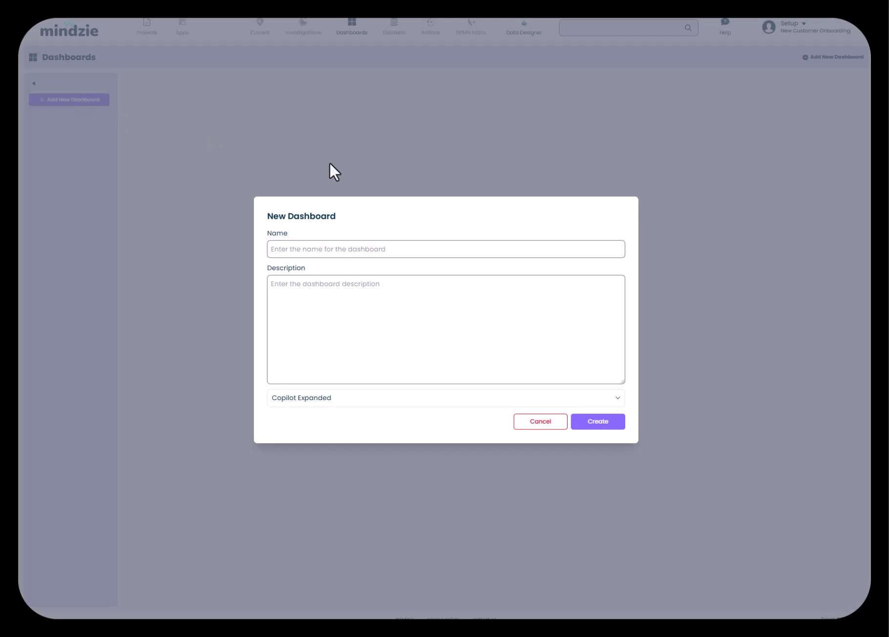
Begin by creating an informational dashboard that documents the project setup, objectives, and structure. Navigate to Dashboards and click "Add New Dashboard".
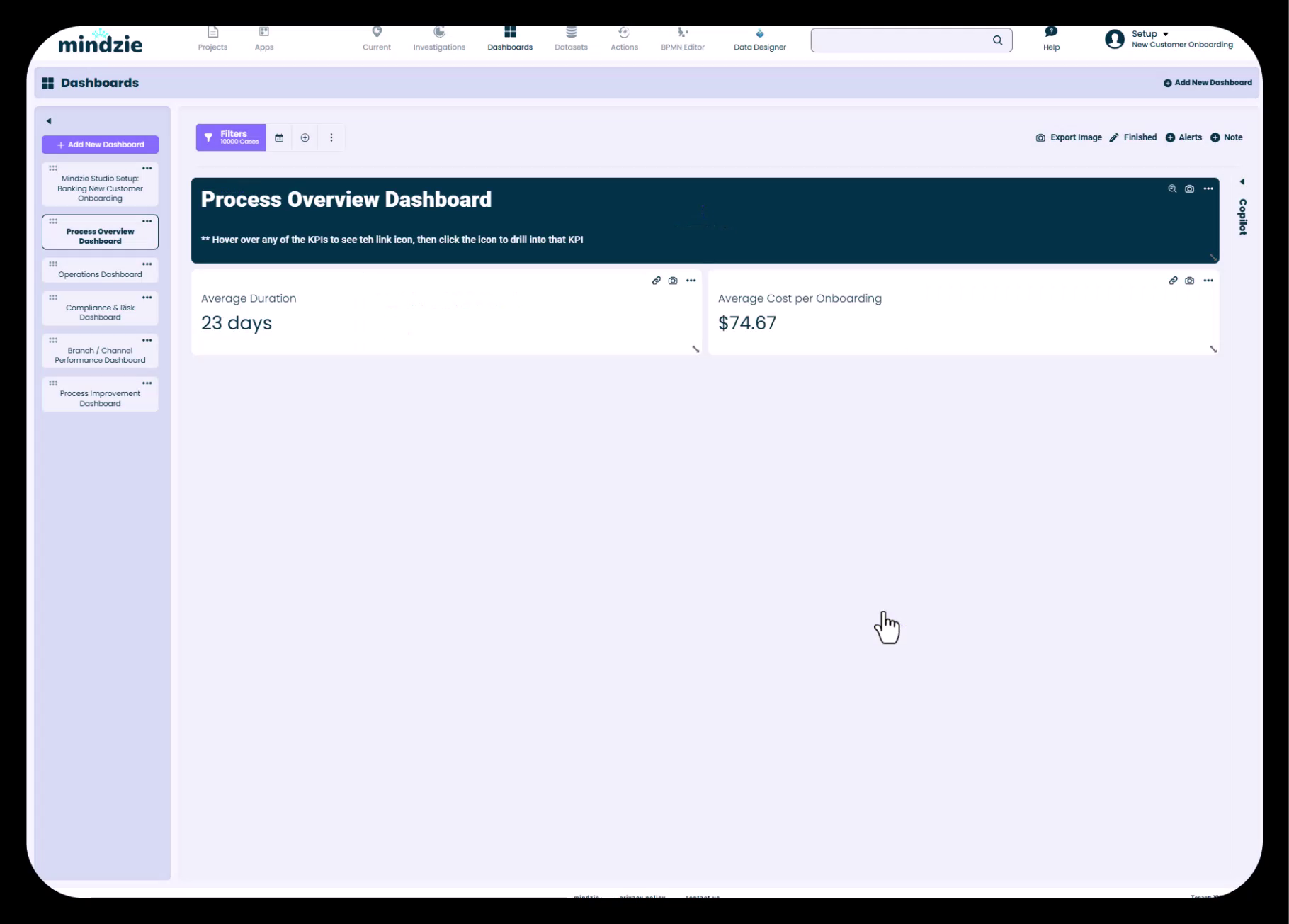
2. Add Documentation Using Markdown
Add a Note panel to your setup dashboard and use markdown language to format documentation:
- Use
#for headers - Use
-or*for bullet lists - Use
**text**for bold emphasis - Disable the panel title for cleaner presentation
- Configure background and text colors for visual appeal
Document key information such as:
- Project purpose and scope
- Data sources and date ranges
- Key metrics and definitions
- Dashboard descriptions and intended audiences
- Contact information for project owners
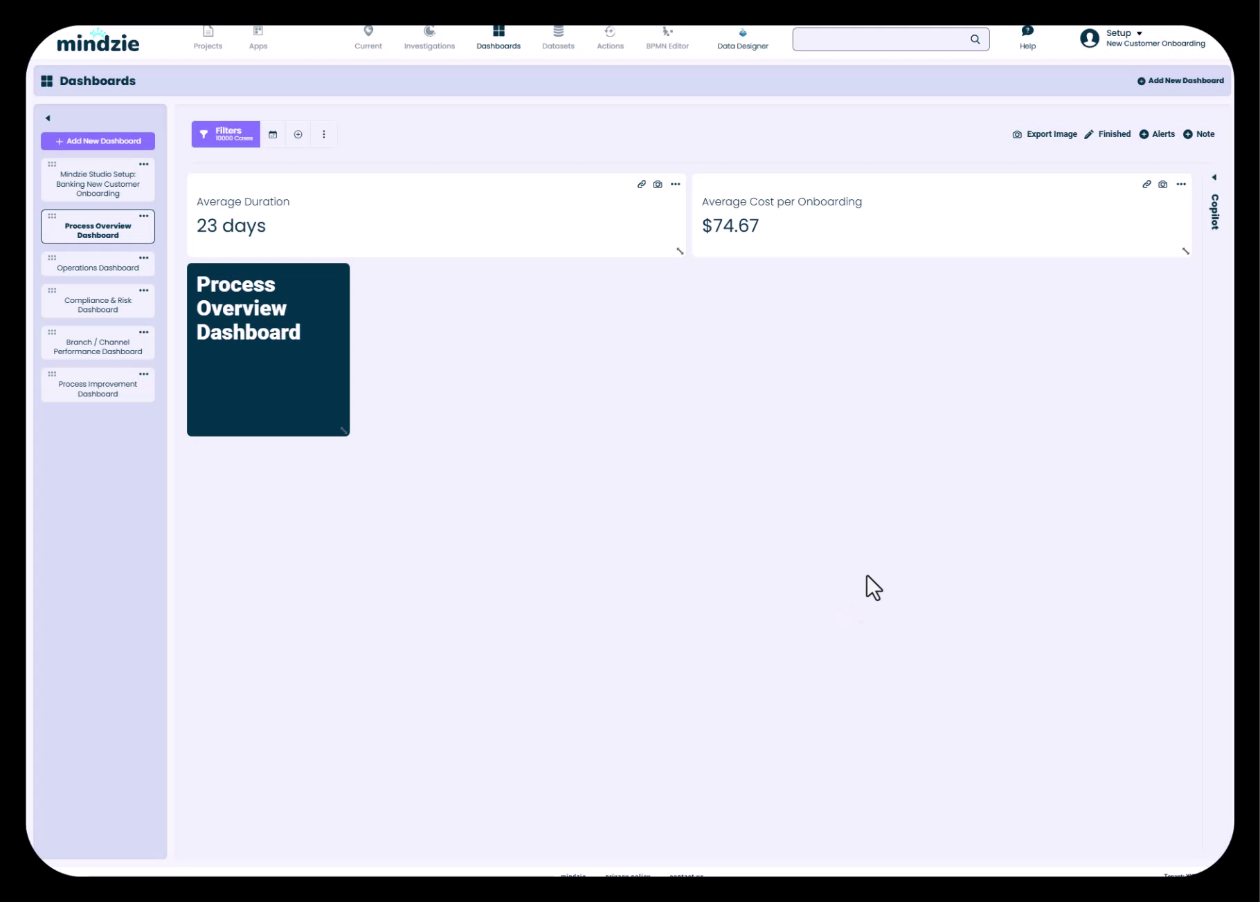
3. Create Role-Based Dashboard Structure
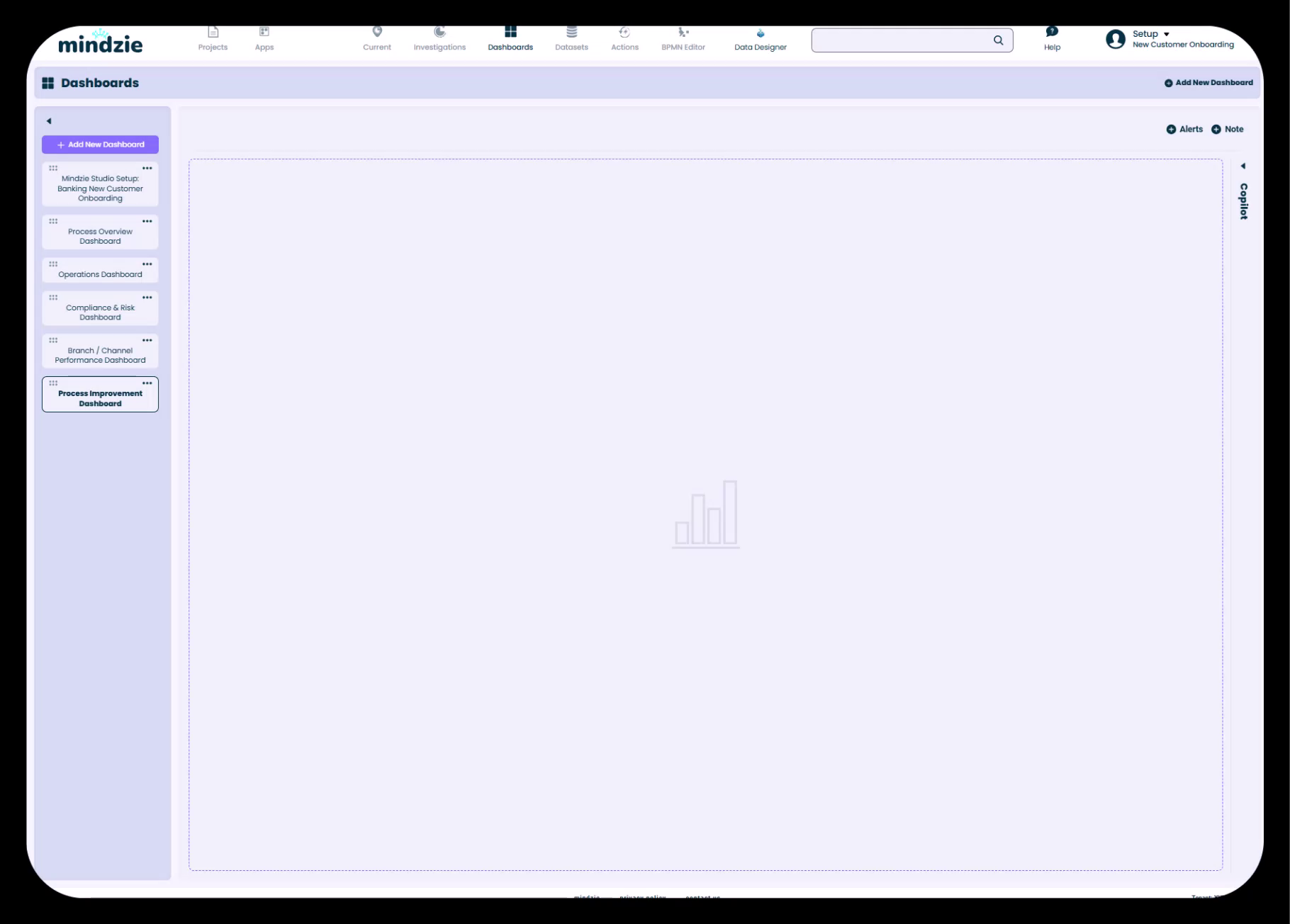
Design dashboards for different user personas and business functions. Common dashboard types include:
- Executive/Process Overview - High-level KPIs and summary metrics for leadership
- Operations Dashboard - Detailed operational metrics for process managers and team leads
- Compliance & Risk - Regulatory compliance tracking and process conformance metrics
- Branch/Department Manager - Location-specific or department-specific performance views
- Process Improvement - Detailed analytical views for process optimization teams
4. Configure Copilot Settings
For each dashboard, decide whether to show or collapse the AI copilot feature:
- Collapsed - Cleaner interface for executive dashboards and simple views
- Expanded - Enhanced functionality for analytical users who will leverage AI assistance
Best Practices
- Align dashboard names with investigation folder names for consistency
- Create dashboards with end users in mind - consider their role, expertise level, and information needs
- Use the setup dashboard to document project structure and guide new users
- Start with 4-6 key dashboards rather than creating dozens of specialized views
- Plan for drill-down navigation from summary to detail
- Consider creating separate dashboards for different time periods or organizational segments
Common Pitfalls to Avoid
- Creating too many dashboards that overwhelm users with choices
- Building dashboards without considering the target audience's needs and skill level
- Inconsistent naming conventions between dashboards and investigations
- Forgetting to create informational/setup documentation
- Building highly technical dashboards for business users or overly simplified views for analysts
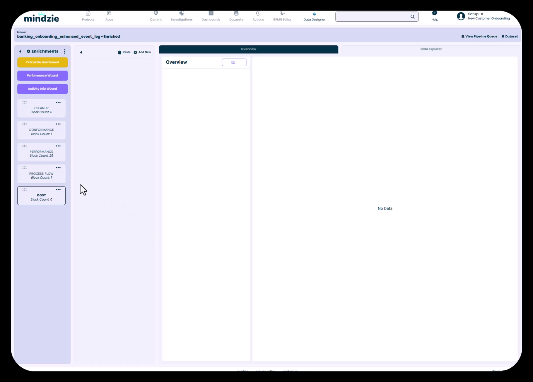
Phase 4: Log Enrichment (Performance, Conformance, Costing)
Objectives
- Enhance raw event log data with calculated attributes
- Create performance metrics with SLA-based categorization
- Implement conformance rules for process compliance
- Calculate activity-based costs
Understanding Log Enrichment
The log enrichment engine is mindzie studio's data enhancement layer. It takes your original event log and creates an enriched dataset containing:
- Performance metrics and duration calculations
- Conformance flags and rule violations
- AI-driven predictions and classifications
- Custom business logic and calculations
- Activity-based costing information
This enriched dataset becomes the foundation for all analysis, enabling sophisticated metrics that go far beyond what exists in the raw data.
Step-by-Step Workflow
Performance Enrichment
1. Access the Log Enrichment Engine
Navigate to Log Enrichment in the main navigation. You'll see a notebook-style interface for organizing enrichment blocks.
2. Launch the Performance Wizard
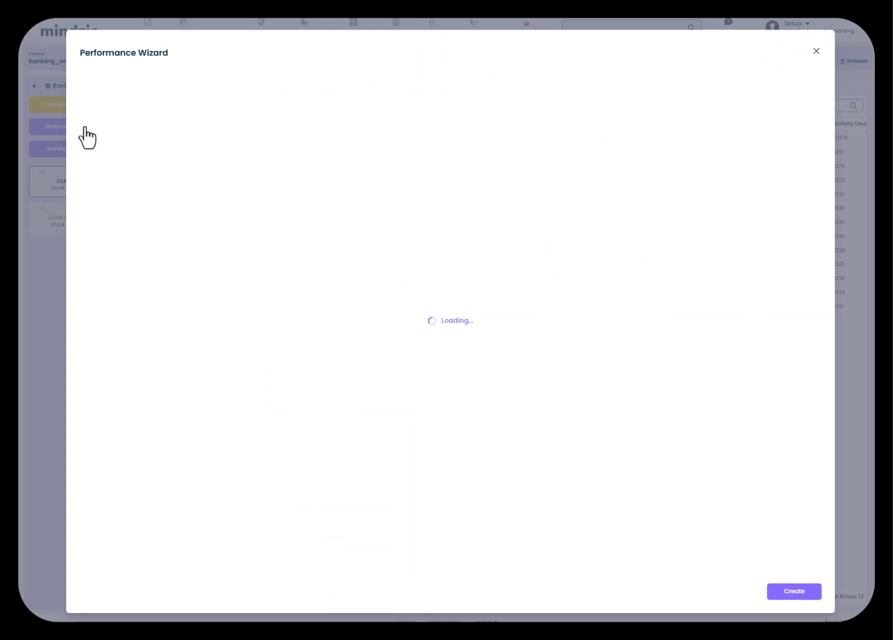
The Performance Wizard automatically analyzes your process and identifies key activity pairs to measure:
- Full case duration (start to finish)
- Duration between significant process steps
- Time in specific process phases
3. Configure Performance Buckets
For each duration metric, the wizard creates three performance categories:
- Fast - Best-case performance (green zone)
- Normal - Acceptable performance (yellow zone)
- Slow - Poor performance requiring attention (red zone)
You can customize the thresholds for each bucket. If your organization has internal SLAs (Service Level Agreements), apply them here to align performance categorization with business standards.
4. Add Custom Activity Pairs
While the wizard automatically identifies common pairs, you can add specific combinations relevant to your process:
- Department-to-department handoffs
- Approval cycle durations
- Customer-facing interaction times
- Any sequence of activities you need to measure
5. Calculate Performance Enrichments
Click "Create" to generate the enrichment blocks. Then click "Calculate Enrichments" to execute the data pipeline and add these new attributes to your enriched dataset.
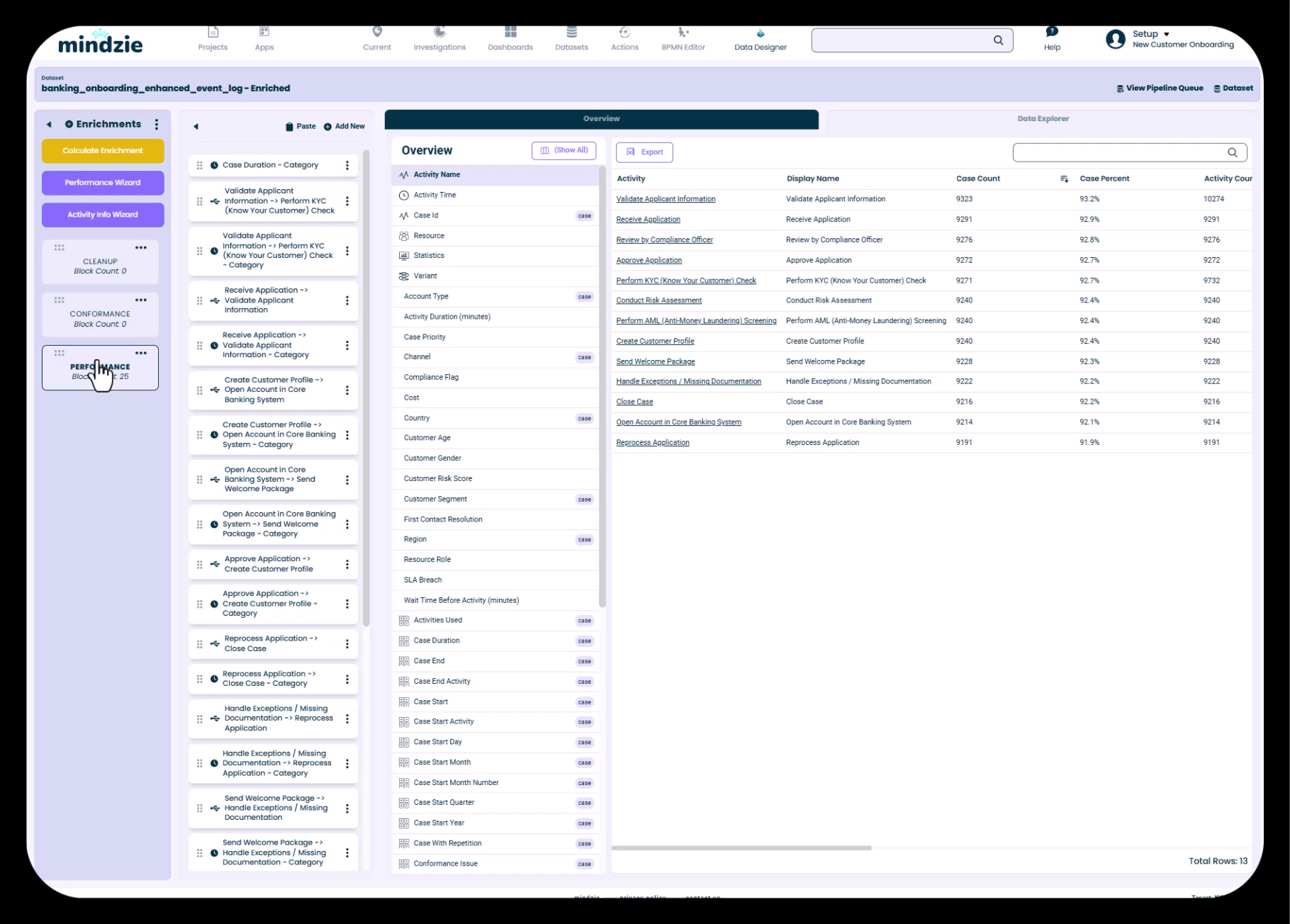
6. Verify Enriched Attributes
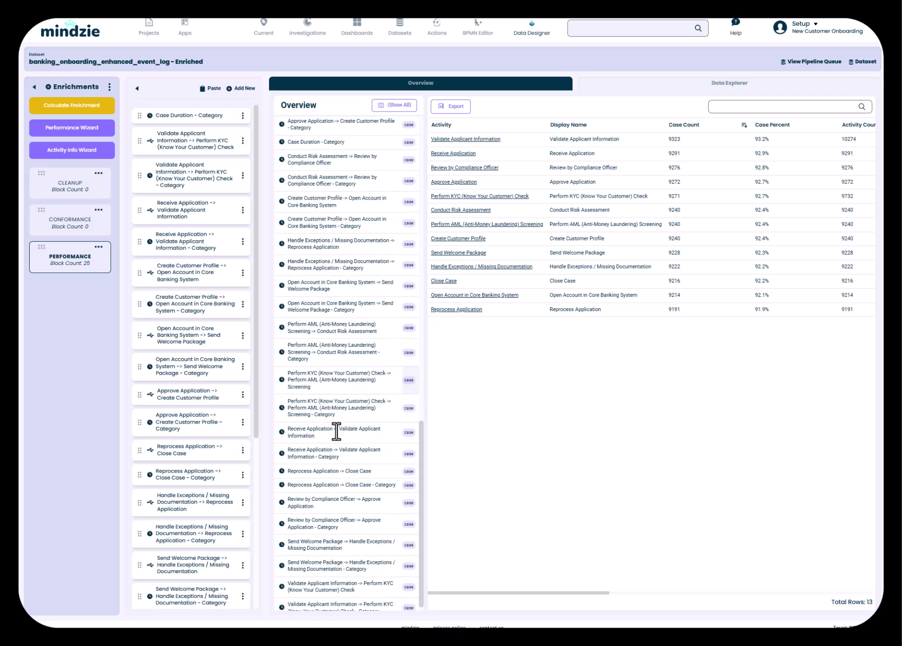
Navigate to the Data Overview to see all newly created attributes. You'll find:
- Original attributes from your uploaded data
- Standard mindzie-generated attributes (case start, case finish, time of day, etc.)
- Performance duration metrics with categorization
- All enrichments available for use in analysis and calculations
Conformance Enrichment
1. Access Conformance Rules
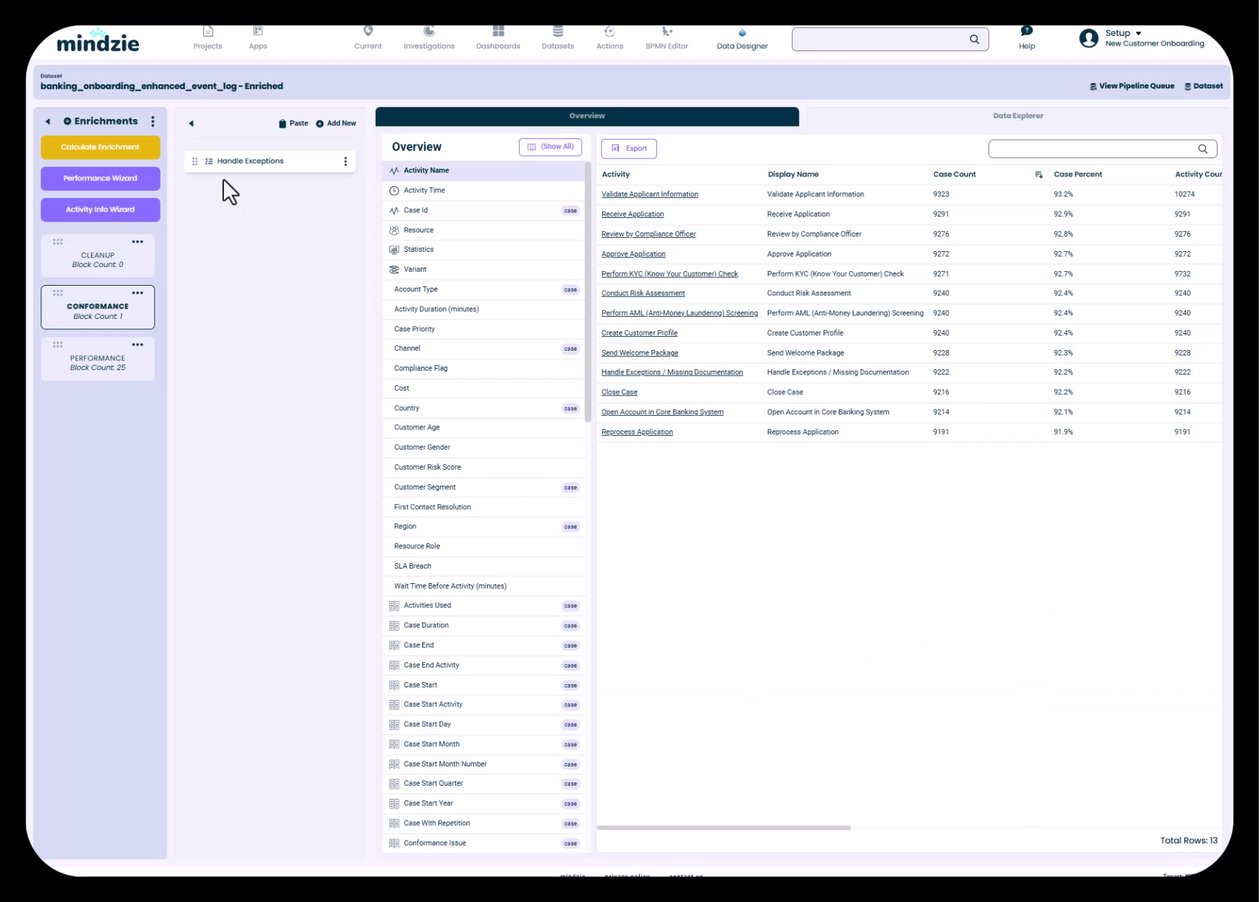
Create a new enrichment notebook or use an existing one. Click "Add New" and select conformance rule types from the library.
2. Configure Undesired Activity Rules
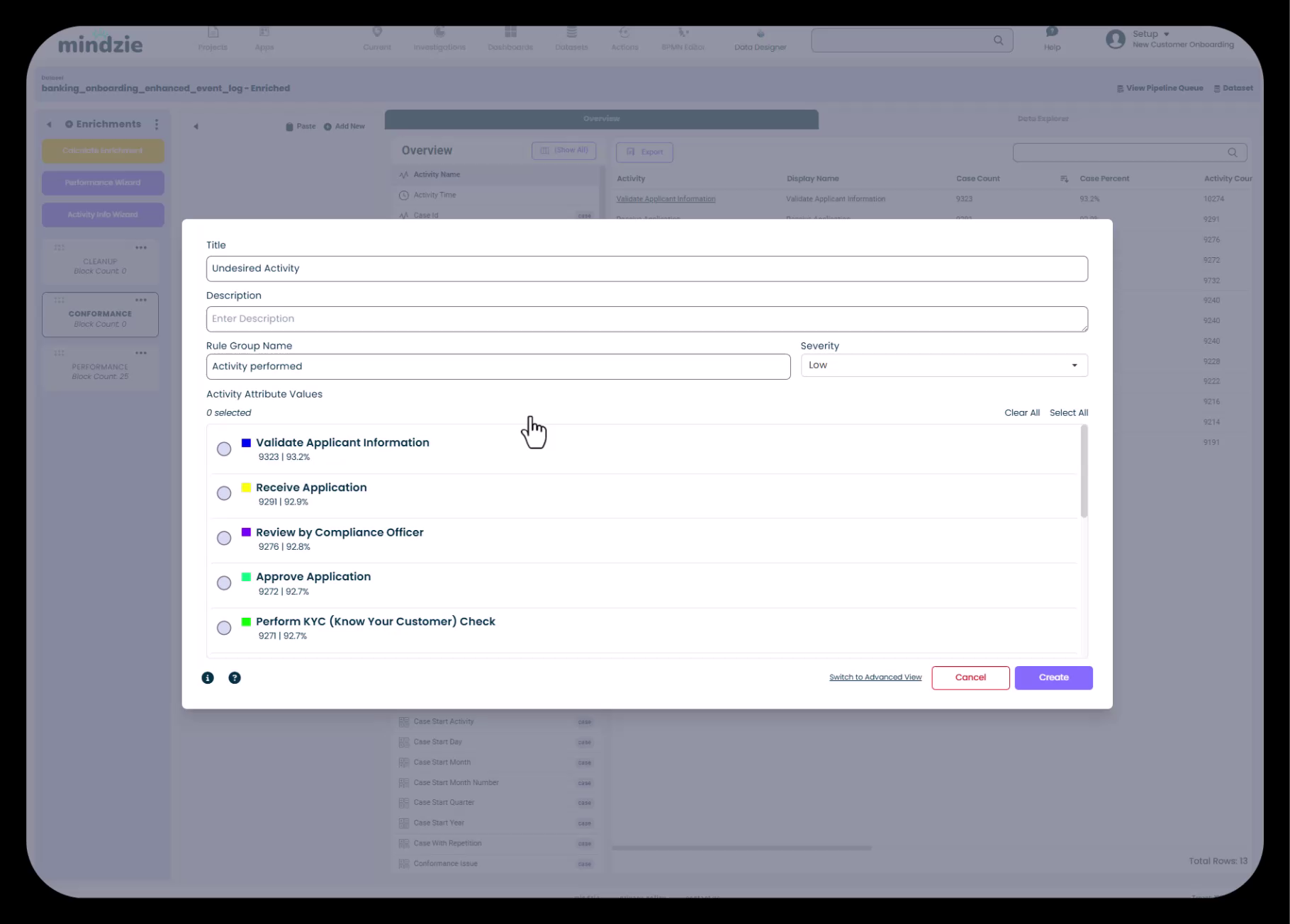
Identify activities that should not occur in ideal process execution:
- Exception handling steps
- Reprocessing activities
- Manual interventions
- Workarounds
Select each undesired activity from your activity list and assign a severity level:
- Low - Minor deviation, informational only
- Medium - Significant issue requiring attention
- High - Critical violation demanding immediate action
3. Configure Additional Conformance Rules
Beyond undesired activities, configure:
- Mandatory Activities - Steps that must occur in every case
- Wrong Activity Order - Activities happening in incorrect sequence
- Repeated Activities - Rework loops and duplicate steps that indicate process inefficiency
- Missing Approval Steps - Required authorizations that were bypassed
4. Calculate Conformance Enrichments
Execute the pipeline to add conformance flags to your dataset. Cases will now be tagged with compliance information usable in filters, reports, and root cause analysis.
Costing Enrichment
1. Launch the Activity Info Wizard
The Activity Info Wizard enables activity-based costing by assigning estimated time and cost to each process step.
2. Assign Costs to Activities
For each activity in your process:
- Specify the estimated time required
- Assign cost based on resource type (e.g., manager rate vs. analyst rate)
- Consider fully-loaded costs including overhead
Activity-based costing provides far more accurate process cost calculations than simple averaging because it accounts for:
- Process variations and different paths through the workflow
- Rework loops and repeated steps
- Exception handling that adds cost
3. Create Cost Summary Enrichments
Use the Summarize enrichment block to aggregate activity costs at the case level:
- Create a new enrichment notebook for cost calculations
- Add a Summarize block
- Select "Estimated Cost" as the attribute to summarize
- Name the new attribute "Case Cost"
- Calculate enrichments to execute the pipeline
This creates a case-level attribute showing the total cost of processing each instance, accounting for all activities that occurred including rework and exceptions.
Best Practices
- Use the Performance Wizard as your starting point, then add custom activity pairs as needed
- Align performance buckets with your organization's actual SLAs and performance targets
- Start with 3-5 key conformance rules rather than attempting to capture every possible violation
- Assign appropriate severity levels to conformance violations based on business impact
- For activity-based costing, use realistic estimates from process owners and finance teams
- Organize enrichments into logical notebooks (Performance, Conformance, Costing) for easy maintenance
- Calculate enrichments frequently during development to see results of your configurations
- Document enrichment logic in notebook descriptions for future reference
Common Pitfalls to Avoid
- Setting unrealistic performance thresholds that categorize most cases as "slow"
- Creating too many conformance rules that flag nearly every case as non-compliant
- Using arbitrary cost estimates without input from finance or process owners
- Forgetting to calculate enrichments after making changes - the pipeline must execute for changes to take effect
- Creating duplicate enrichments that calculate the same metric multiple times
- Not organizing enrichments into logical notebooks, making them difficult to find and maintain
Phase 5: Creating Investigations and Analysis Notebooks
Objectives
- Organize analytical work into investigation folders
- Create analysis notebooks aligned with dashboard structure
- Understand the notebook components and capabilities
Understanding Investigations
Investigations are organizational folders that contain related analysis notebooks. Think of them as project folders that group together all the analytical work for a specific dashboard or business question.
Step-by-Step Workflow
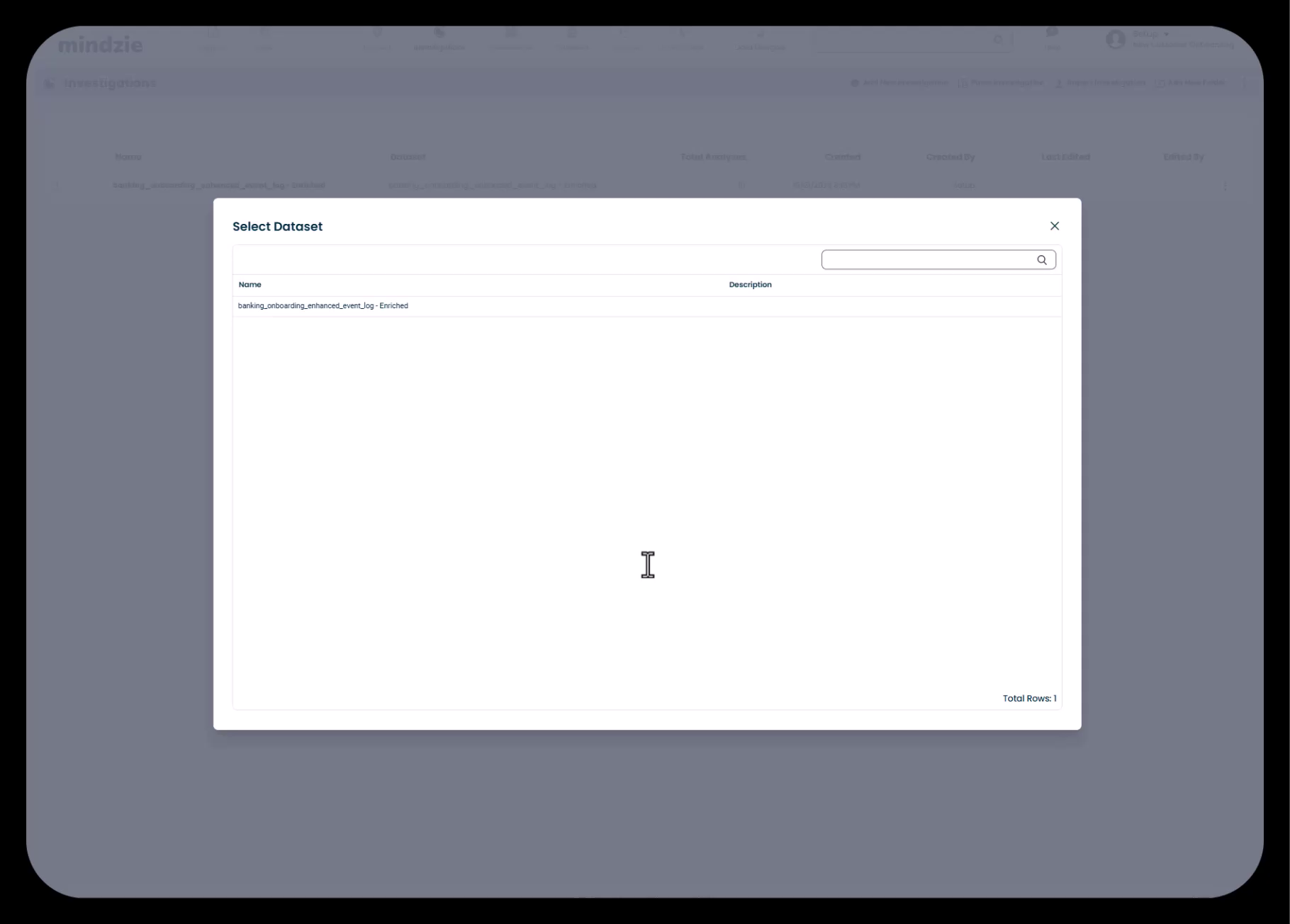
1. Create Investigation Folder
Navigate to Investigations and click "Add Investigation". Best practice is to name the investigation to match the dashboard it will populate (e.g., "Process Overview" investigation feeds the "Process Overview" dashboard).
Select the enriched dataset as your data source - this ensures your analysis has access to all the enhanced attributes created through log enrichment.
2. Create Analysis Notebooks
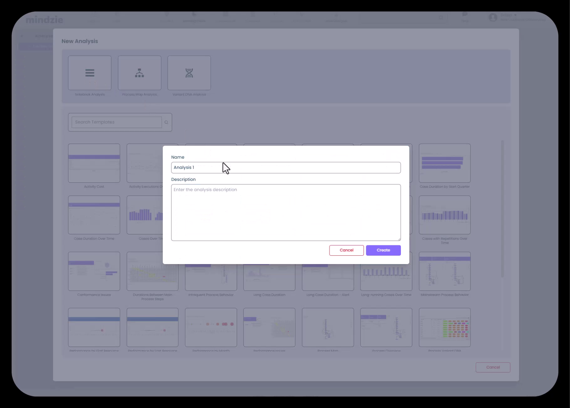
Within each investigation, create analysis notebooks for specific metrics or KPIs. Click "Add Analysis" and choose from:
- Blank Notebook - Start from scratch with an empty analytical workspace
- Process Map Notebook - Pre-configured with process flow visualization
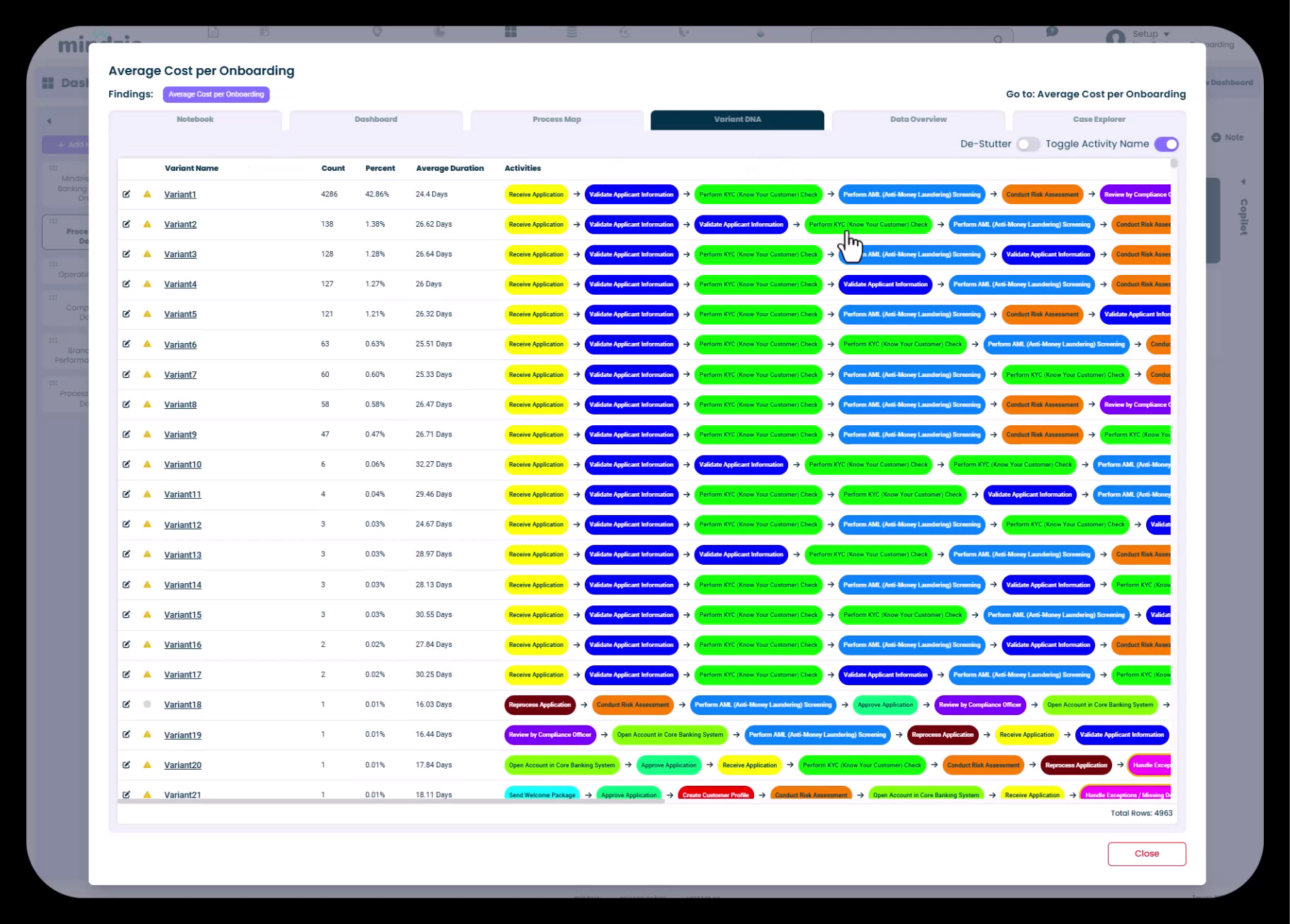
- Variant DNA Analysis - Pre-configured for analyzing process variation patterns
3. Understand Notebook Components
Each analysis notebook contains multiple tabs:
- Analysis Tab - The main workspace for building metrics using filters and calculators
- Local Dashboard - A summary view of all metrics published from this notebook
- Process Map - Visual representation of process flow and frequencies
- Variant DNA - Analysis of different paths through the process
- Data Overview - Summary statistics and attribute information
- Case Explorer - Detailed case-by-case examination
- AI Copilot - Intelligent assistance for analysis creation
4. Name Analysis with Descriptive Titles
Create analysis notebooks with names that clearly describe the metric or insight being developed. Examples:
- "Average Onboarding Duration"
- "Cost Per Case Analysis"
- "Compliance Violation Tracking"
- "Branch Performance Comparison"
Best Practices
- Create one investigation for each major dashboard to maintain clear organization
- Name investigations to match their corresponding dashboards
- Use descriptive analysis names that indicate the metric being calculated
- Select the enriched dataset (not the original dataset) for all investigations
- Create separate analyses for distinct metrics rather than combining multiple unrelated KPIs
- Leverage analysis templates when they match your needs to save time
- Use the AI copilot to assist with complex analysis creation
Common Pitfalls to Avoid
- Creating analyses without a clear purpose or end goal
- Mixing unrelated metrics in a single analysis notebook
- Using the original dataset instead of the enriched dataset
- Generic analysis names that don't describe what's being measured
- Creating too many investigations that mirror the same structure
- Not deleting default analyses that don't align with your project structure
Phase 6: Building Metrics with Filters and Calculators
Objectives
- Understand the analysis-filter-calculator paradigm
- Create metrics using mindzie's low-code/no-code interface
- Leverage enriched attributes for powerful calculations
The Analysis-Filter-Calculator Paradigm
mindzie studio uses a block-based approach to building metrics:
- Analysis - The workspace or notebook where you're working (like a worksheet)
- Filters - Blocks that isolate specific data segments you want to analyze
- Calculators - Visualization blocks that calculate and display metrics
Filters and calculators can be combined in any arrangement to create sophisticated analysis.
Step-by-Step Workflow
1. Open an Analysis Notebook
Navigate to the analysis where you want to create a metric. You'll work primarily in the Analysis tab.
2. Add Filters (Optional)
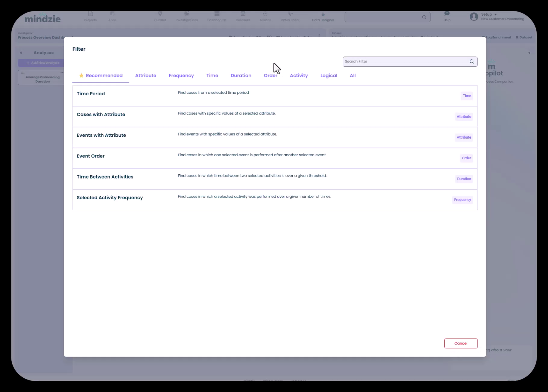
Click "Add Filter" to isolate specific data segments. mindzie studio provides pre-built filter types:
- Attribute-based filters - Filter by specific attribute values (division, department, region, etc.)
- Time-based filters - Filter by date ranges or time periods
- Case attribute filters - Filter based on case-level characteristics
- Performance filters - Filter by duration categories (fast, normal, slow)
- Conformance filters - Filter by compliance status or rule violations
Filters are optional - if you want to analyze all cases, simply skip filtering and add calculators directly.
3. Add Calculators
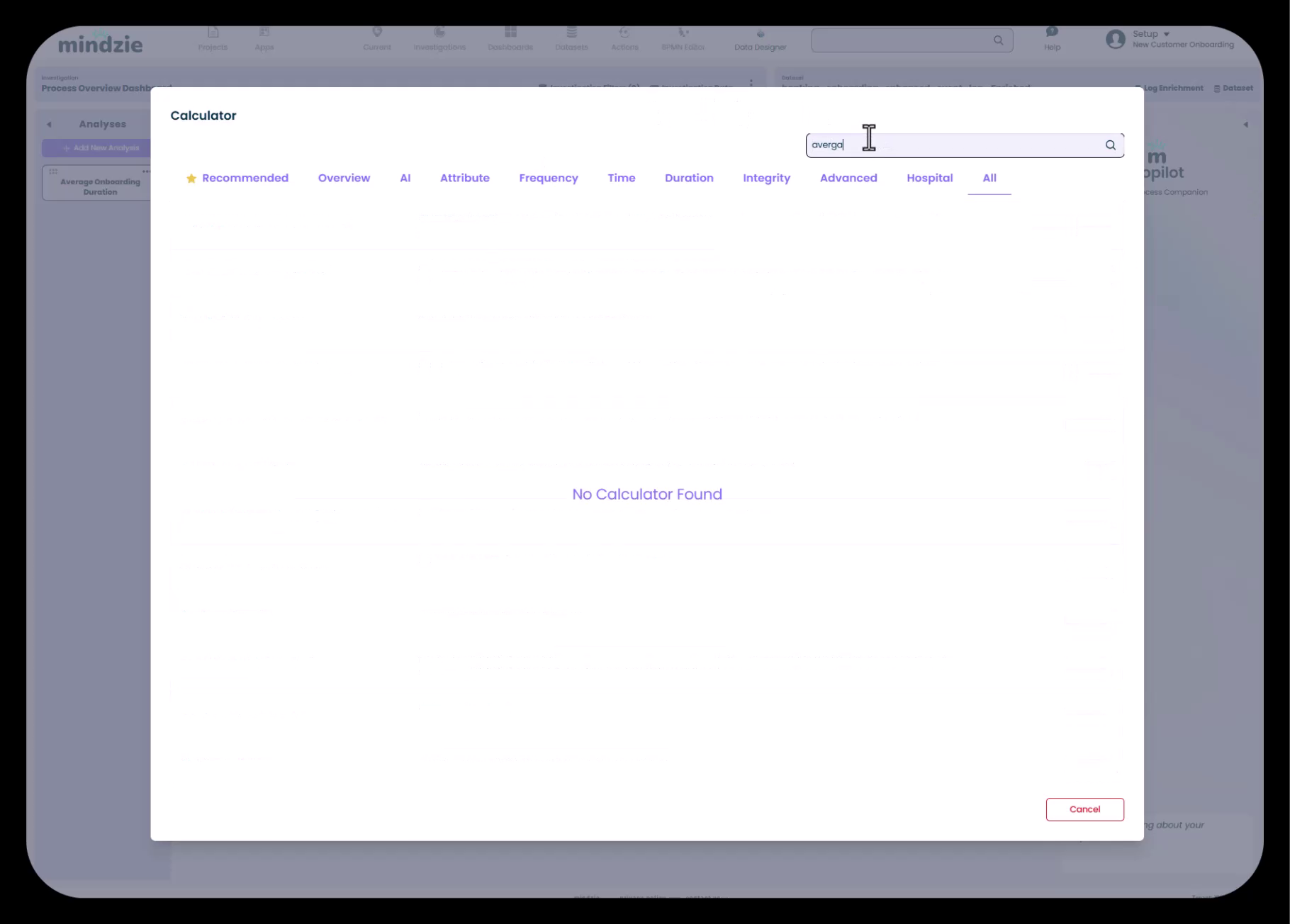
Click "Add Calculator" to browse mindzie's extensive library of visualization and calculation types:
- Statistical calculators - Average, median, sum, count, percentiles
- Trend calculators - Show metric changes over time
- Breakdown calculators - Group data by attribute values
- Process map calculators - Visualize process flows
- Chart calculators - Bar charts, line charts, pie charts, histograms
- Table calculators - Detailed tabular data views
- Specialized calculators - Root cause analysis, variant analysis, resource utilization
4. Configure Calculator Parameters

After selecting a calculator type, configure its parameters:
- Attribute Selection - Choose which attribute to calculate (e.g., Case Duration, Case Cost)
- Grouping Options - How to segment the data
- Time Granularity - Daily, weekly, monthly aggregation
- Visualization Settings - Colors, labels, display options
Because you've enriched your data in Phase 4, you have access to calculated attributes like:
- Case Duration
- Performance categories
- Conformance flags
- Case Cost
- Activity pair durations
5. Combine Multiple Filters and Calculators
Build sophisticated analysis by combining blocks:
- Multiple filters to narrow down to very specific cases
- Multiple calculators to show different views of the same filtered data
- Comparison metrics by duplicating analysis and changing filter parameters
6. Add Descriptions and Notes
Document your analysis using:
- Analysis descriptions - Explain what this analysis measures and why
- Note calculators - Add explanatory text within the analysis
- Title and subtitle settings - Clear labeling for each calculator block
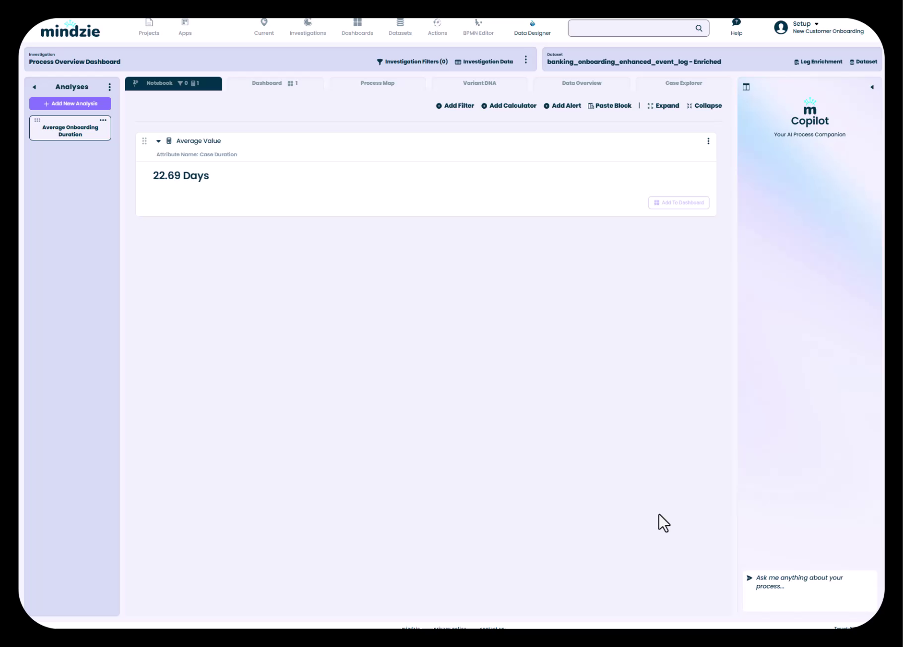
Real-World Example: Average Onboarding Duration
Following the banking onboarding example:
- Create analysis named "Average Onboarding Duration"
- Skip filters (analyzing all cases)
- Add "Average" calculator
- Select "Case Duration" attribute (created by Performance Wizard)
- Result: A metric showing the average time to complete customer onboarding
- Add description explaining methodology
Best Practices
- Start simple with a single calculator, then add complexity as needed
- Use filters to create multiple views of the same metric (by region, by department, by time period)
- Leverage enriched attributes created in Phase 4 for powerful calculations
- Add note calculators to explain complex analysis within the notebook
- Use descriptive titles for all calculators so their purpose is immediately clear
- Test calculator configurations with different attributes to understand capabilities
- Create comparative analysis by duplicating notebooks and changing filter parameters
Common Pitfalls to Avoid
- Building overly complex analysis with too many filters that result in no data
- Forgetting that enriched attributes must be calculated before they appear in the attribute list
- Using confusing or generic calculator titles that don't describe what's being shown
- Not adding descriptions or documentation to complex analysis
- Trying to build analysis on the original dataset instead of the enriched dataset
- Creating filters that contradict each other and return zero results
Phase 7: Publishing to Local and Global Dashboards
Objectives
- Understand local vs. global dashboard concepts
- Publish metrics from notebooks to dashboards
- Configure drill-down behavior and user guidance
Understanding Dashboard Types
mindzie studio uses a two-tier dashboard architecture:
Local Dashboards
- Contained within a single analysis notebook
- Summarizes all metrics created in that notebook
- Used by analysts to organize their work
- Accessed via the "Dashboard" tab within the notebook
Global Dashboards
- User-facing dashboards visible from the main Dashboards menu
- Aggregate metrics from multiple analysis notebooks
- Used for end-user consumption and executive reporting
- Support drill-down to underlying analysis
Step-by-Step Workflow
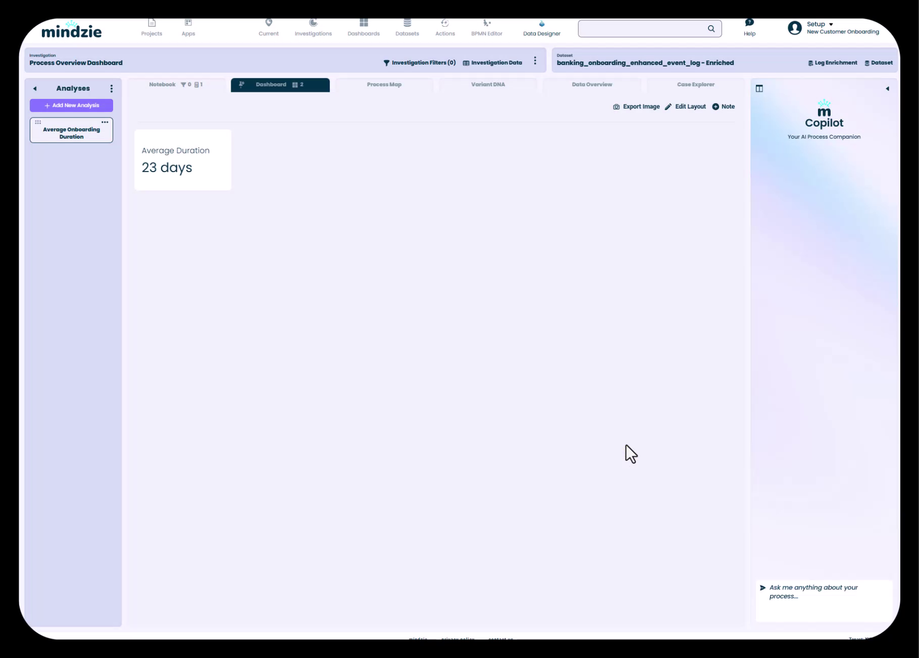
1. Publish to Local Dashboard
After creating a calculator in your analysis, click the three-dot menu and select "Publish to Local Dashboard":
- Provide a panel title
- The metric appears on the notebook's Dashboard tab
- This creates a summary view of all work in the notebook
2. Publish to Global Dashboard
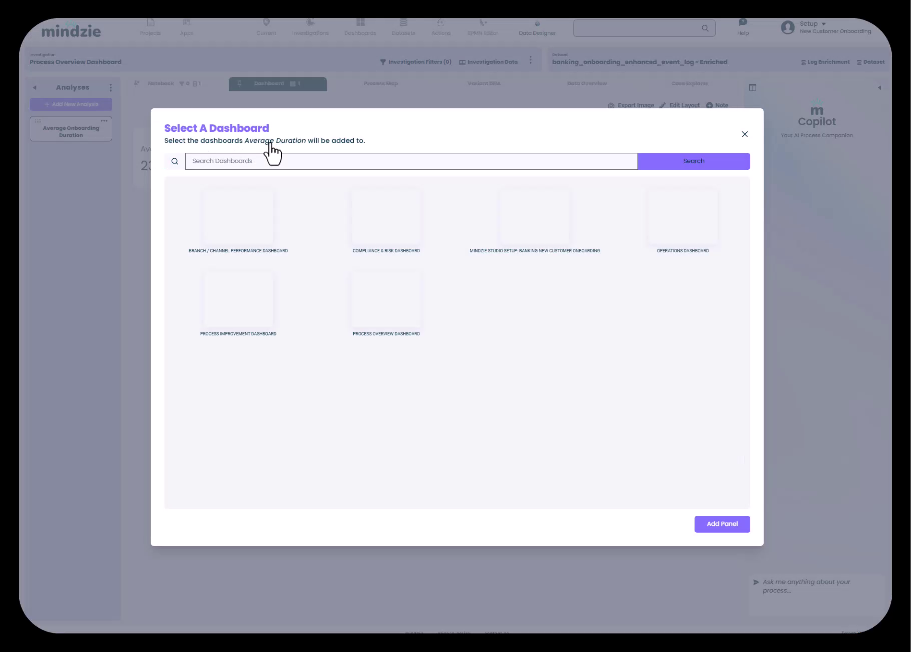
To make metrics available to end users:
- Hover over the published panel in the local dashboard
- Click the three-dot menu
- Select "Add to Dashboard"
- Choose the target global dashboard from the list
- The metric now appears in the user-facing dashboard
3. Configure Drill-Down Behavior
When users click on a dashboard panel in a global dashboard, mindzie studio opens the underlying analysis notebook. Control which tab users see by default:
- Navigate to the notebook view
- Use the Pin icon to select the default tab
- Options include: Analysis, Dashboard, Process Map, Variant DNA, Data Overview, Case Explorer
- Most commonly, pin the "Dashboard" tab for cleaner presentation
4. Add User Guidance Notes
Help users understand and interact with dashboard metrics:
- Click the three-dot menu on any dashboard panel
- Select "Add Note"
- Write helpful guidance such as:
- What the metric measures
- How to interpret the values
- Instructions for drilling down
- Context about thresholds or targets
- When the data was last updated
Example note: "This shows the average duration of each case. Click the drill-in icon to see detailed analysis including process maps and case breakdowns."
Best Practices
- Always publish to local dashboard first to organize your analytical work
- Use consistent panel titles across local and global dashboards
- Pin the most relevant tab for end users when configuring drill-down behavior
- Add contextual notes to complex metrics to guide user interpretation
- Organize global dashboards logically, grouping related metrics together
- Test drill-down navigation from the end-user perspective
- Create separate dashboards for different audiences rather than one dashboard trying to serve everyone
- Use the Edit Layout feature to arrange panels logically on global dashboards
Common Pitfalls to Avoid
- Publishing metrics to global dashboards without first organizing them in local dashboards
- Not configuring drill-down behavior, leaving users to land on unfamiliar tabs
- Missing or unclear panel titles that don't explain what's being measured
- Overcrowding dashboards with too many metrics that overwhelm users
- Forgetting to add guidance notes for complex or unfamiliar metrics
- Publishing draft or experimental analysis to global dashboards
- Not testing the drill-down experience from the end-user perspective
Phase 8: Formatting and User Experience Optimization
Objectives
- Create professional, visually appealing dashboards
- Add instructional content for user guidance
- Optimize layout and organization
- Implement color schemes and branding
Step-by-Step Workflow
1. Edit Dashboard Layout
Click "Edit Layout" on any global dashboard to enter layout editing mode:
- Drag and drop panels to rearrange
- Resize panels by dragging edges
- Create multi-column layouts for compact dashboards
- Maximize panels for emphasis on key metrics
- Preview changes before saving
Common layout patterns:
- Executive Layout - Large, prominent KPIs with minimal detail
- Operational Layout - Dense grid of smaller metrics for monitoring
- Analytical Layout - Fewer, larger panels with supporting context
2. Add Instructional Note Panels
Use note panels to provide context and guidance:
Creating Formatted Notes:
- Add a Note panel to the dashboard
- Click "Disable Title" for cleaner presentation
- Use markdown for formatting:
# Headerfor large headers## Subheaderfor section headers**bold**for emphasis-or*for bullet lists- Links using
[text](url)syntax
Typical Note Content:
- Dashboard purpose and audience
- How to use the dashboard
- Instructions for drilling down into metrics
- Definitions of key terms
- Contact information for questions
- Last updated information
3. Apply Color Schemes
Make dashboards visually appealing and aligned with branding:
Background Colors:
- Dark backgrounds for executive dashboards (professional, high-contrast)
- Light backgrounds for operational dashboards (traditional, data-dense)
Text Colors:
- White text on dark backgrounds
- Dark text on light backgrounds
- Ensure sufficient contrast for readability
Panel Styling:
- Consistent color schemes across related dashboards
- Use brand colors when appropriate
- Consider accessibility in color choices
4. Position Instructional Content
Best practices for note panel placement:
- Top of dashboard - Overview information, instructions, navigation guidance
- Between sections - Section headers and context for grouped metrics
- Bottom of dashboard - Supplementary information, disclaimers, metadata
5. Configure Panel Titles and Descriptions
For each metric panel:
- Use clear, business-friendly titles
- Add descriptions via the three-dot menu
- Include hover text that provides additional context
- Explain thresholds, targets, or benchmarks
6. Test User Experience
Before finalizing:
- View dashboards as an end user (not in edit mode)
- Test drill-down functionality
- Verify all notes display correctly
- Check responsive behavior on different screen sizes
- Confirm color contrast is readable
- Have a representative end user review and provide feedback
Advanced Formatting Techniques
Full-Screen Informational Panels
- Create note panels that span the full dashboard width
- Use for welcome screens or setup documentation
- Apply dramatic color schemes for impact
Hover Instructions Example note text for panels:
Hover over any KPI to see the link icon, then click to drill into detailed analysis.
Section Organization Group related metrics together:
- Use note panels as section dividers
- Create visual hierarchy through sizing
- Align related panels for clean appearance
Best Practices
- Design dashboards with the end user in mind - consider their technical expertise and information needs
- Use markdown formatting consistently across all note panels
- Maintain a cohesive color scheme throughout the entire project
- Provide clear instructions for drilling down into metrics
- Balance visual appeal with information density
- Test dashboards with actual end users before finalizing
- Create a setup/welcome dashboard that orients new users
- Use edit layout mode to create professional, organized dashboard appearances
- Add contact information so users know who to ask for help
Common Pitfalls to Avoid
- Creating visually cluttered dashboards with too many colors and styles
- Using low-contrast color combinations that are hard to read
- Forgetting to disable note panel titles, creating redundant headers
- Placing instructional content at the bottom where users may not see it
- Inconsistent formatting across dashboards in the same project
- Over-designing to the point where form overshadows function
- Not testing the user experience from a non-editor perspective
- Using technical terminology in user-facing dashboards without explanation
Iterative Refinement and Continuous Improvement
The Iterative Approach
Building a mindzie studio project is not a linear process - it requires iteration and refinement:
During Development:
- Create dashboard structure → Realize you need additional dashboards
- Build enrichments → Discover new attributes would be valuable
- Create initial metrics → Identify gaps in analysis
- Publish dashboards → Receive user feedback requiring adjustments
After Initial Deployment:
- Monitor which dashboards and metrics users actually consume
- Gather feedback on clarity and usefulness
- Identify additional analysis needs
- Refine based on real-world usage patterns
Reusing and Adapting Work
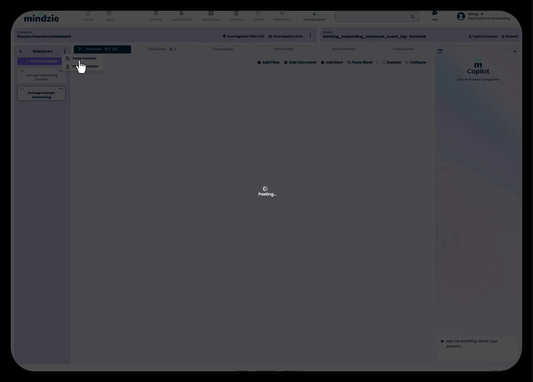
mindzie studio supports efficient reuse through copy-paste functionality:
Copying Between Projects:
- Open multiple projects in separate browser tabs
- Copy entire analysis notebooks from one project to another
- Copy enrichment notebooks to cascade common calculations
- Paste into target project and adapt as needed
Adapting Copied Content: When copying analysis from other projects:
- Update Titles and Descriptions - Change to match the new context
- Remove Irrelevant Filters - Delete filters that don't apply to the new dataset
- Update Attribute Selections - Ensure calculators reference attributes that exist in the new data
- Verify Enrichments Match - Confirm that copied enrichments work with your dataset structure
- Recalculate - Execute the pipeline to apply changes
When to Reuse vs. Create New:
- Reuse - Standard metrics like average duration, cost calculations, common conformance rules
- Create New - Process-specific analysis that doesn't translate across projects
Monitoring and Refresh
mindzie studio supports two operational modes:
Discovery Mode - Initial process analysis to understand how things work
- One-time data upload
- Exploratory analysis
- Process redesign insights
Continuous Monitoring Mode - Ongoing performance tracking
- Scheduled data updates from mindzie Data Designer
- Manual CSV refreshes with updated data
- Automatic metric recalculation
- Trend analysis over time
When data refreshes:
- All metrics automatically recalculate
- Dashboards update with current values
- Historical trends incorporate new data points
- Users can monitor improvement or degradation
Best Practices for Iteration
- Accept that initial designs will evolve based on usage and feedback
- Build incrementally rather than trying to perfect everything before deployment
- Gather user feedback early and often
- Document changes and versions for complex projects
- Create a backlog of enhancement ideas as they emerge
- Regularly review which dashboards and metrics are actually being used
- Archive or delete unused content to keep the project organized
- Schedule periodic reviews with stakeholders to assess effectiveness
Common Pitfalls to Avoid
- Perfectionism that delays deployment and prevents learning from real usage
- Making changes based on feedback from a single user without broader validation
- Not documenting the logic behind complex analysis before making changes
- Copying enrichments between projects without verifying they match the data structure
- Overwhelming users with too many changes too quickly
- Forgetting to test after making iterative changes
- Not maintaining version control or documentation of significant changes
Complete Workflow Checklist
Use this checklist to ensure you've completed all essential phases:
Phase 1: Project Setup
- Project created with descriptive name
- Thumbnail uploaded (if customer-facing)
- Team members assigned with appropriate permissions
- Project accessible to all required users
Phase 2: Data Configuration
- Data uploaded via CSV or Data Designer
- Case ID, Activity, Timestamp columns mapped correctly
- Resource column mapped (if available)
- Data import completed successfully
- Original and enriched datasets created
- Default analyses reviewed
Phase 3: Dashboard Planning
- Setup/information dashboard created with documentation
- Role-based dashboard structure planned
- Dashboard names align with user roles and needs
- Copilot settings configured for each dashboard
- Dashboard hierarchy makes logical sense
Phase 4: Log Enrichment
- Performance Wizard executed with appropriate thresholds
- Custom activity pairs added as needed
- Conformance rules configured for key violations
- Activity-based costing implemented (if applicable)
- Cost summarization created at case level
- All enrichments calculated and verified in data overview
- Enrichments organized into logical notebooks
Phase 5: Investigations and Analysis
- Investigations created aligned with dashboards
- Analysis notebooks created for key metrics
- Enriched dataset selected for all investigations
- Descriptive names assigned to all analyses
- Default analyses that don't align removed or reorganized
Phase 6: Metrics Creation
- Filters created to segment data appropriately
- Calculators selected from library and configured
- Enriched attributes leveraged in calculations
- Descriptions added to complex analyses
- Multiple views created using filter combinations
- Analysis tested and validated
Phase 7: Publishing
- Metrics published to local dashboards first
- Metrics published to appropriate global dashboards
- Drill-down tabs pinned to optimal views
- Guidance notes added to complex metrics
- Publishing tested from end-user perspective
Phase 8: Formatting and UX
- Dashboard layouts optimized using edit mode
- Instructional note panels added
- Color schemes applied consistently
- Markdown formatting used effectively
- User guidance provided for navigation and drill-down
- End-user testing completed
- Feedback incorporated
Deployment Readiness
- All dashboards reviewed for quality and completeness
- Setup documentation accurate and helpful
- User training materials prepared (if needed)
- Data refresh process established
- Support contacts and escalation paths documented
- Success metrics defined for project evaluation
Key Principles for Success
1. User-Centric Design Always build with the end user in mind. Consider their role, technical expertise, and information needs at every phase.
2. Front-to-Back Methodology Plan the dashboard structure before diving into detailed analysis. This ensures a coherent end-user experience.
3. Leverage Enrichment The log enrichment engine is mindzie's superpower. Invest time in Phase 4 to create powerful attributes that enable sophisticated analysis.
4. Iterative Development Don't try to perfect everything before deployment. Build incrementally, gather feedback, and refine.
5. Documentation and Guidance Document your work thoroughly. Future you (and your colleagues) will thank you.
6. Reuse and Standardize Build a library of reusable enrichments, analyses, and dashboard patterns that can be adapted for new projects.
7. Test from the User Perspective Regularly step out of edit mode and experience your project as an end user would.
8. Balance Complexity and Accessibility Create sophisticated analysis for power users while maintaining simple, clear dashboards for executives.
Additional Resources
For detailed guidance on specific phases, refer to these companion documents:
- Getting Started: Creating Your First mindzie studio Project - Deep dive into Phase 1
- Uploading and Configuring Data Sources - Detailed Phase 2 instructions
- Planning Your Dashboard Structure for Different User Roles - Strategic guidance for Phase 3
- Mastering the Log Enrichment Engine - Comprehensive Phase 4 tutorial
- Working with Investigations and Analysis Notebooks - Phase 5 details
- Creating Analysis with Filters and Calculators - Phase 6 step-by-step guide
- Publishing Metrics from Notebooks to Dashboards - Phase 7 how-to
- Designing User-Friendly Dashboards with Notes and Formatting - Phase 8 best practices
- Understanding mindzie's Dual Dataset Architecture - Conceptual foundation
- Building Conformance Rules for Process Compliance - Advanced enrichment techniques
- Advanced: Implementing Activity-Based Costing - Detailed costing methodology
- Reusing Analysis: Copying and Adapting Notebooks - Efficiency techniques
- Working with Root Cause Analysis - AI-powered analysis features
- Understanding Drill-Down and Continuous Monitoring - Operational concepts
Visit the official mindzie documentation at https://docs.mindziestudio.com/ for additional tutorials, API references, and feature updates.
Conclusion
Building a complete mindzie studio project from data to dashboards follows a structured eight-phase approach that transforms raw event logs into actionable process intelligence. By following this end-to-end workflow summary, you'll create professional, user-focused solutions that support both initial process discovery and ongoing continuous improvement monitoring.
Remember that mindzie studio is highly configurable and supports many different use cases and deployment patterns. Use this workflow as a framework, but adapt it to your specific organizational needs, user requirements, and process characteristics.
The key to success is maintaining focus on your end users throughout all eight phases - build for them, test with them, and refine based on their feedback. With this user-centric approach and the comprehensive workflow outlined in this guide, you'll deliver process intelligence solutions that drive real business value and continuous improvement.