Process Maps
Process Maps draws your process from the log: every activity the cases went through, and the paths between them. Use it to see the shape of the process at a glance, then click into any step or path to see the cases behind it.
The screen has three views of the same log, chosen with the switch at the top: Process Map, Train Map and BPMN Map. The rest of this page takes them in that order.
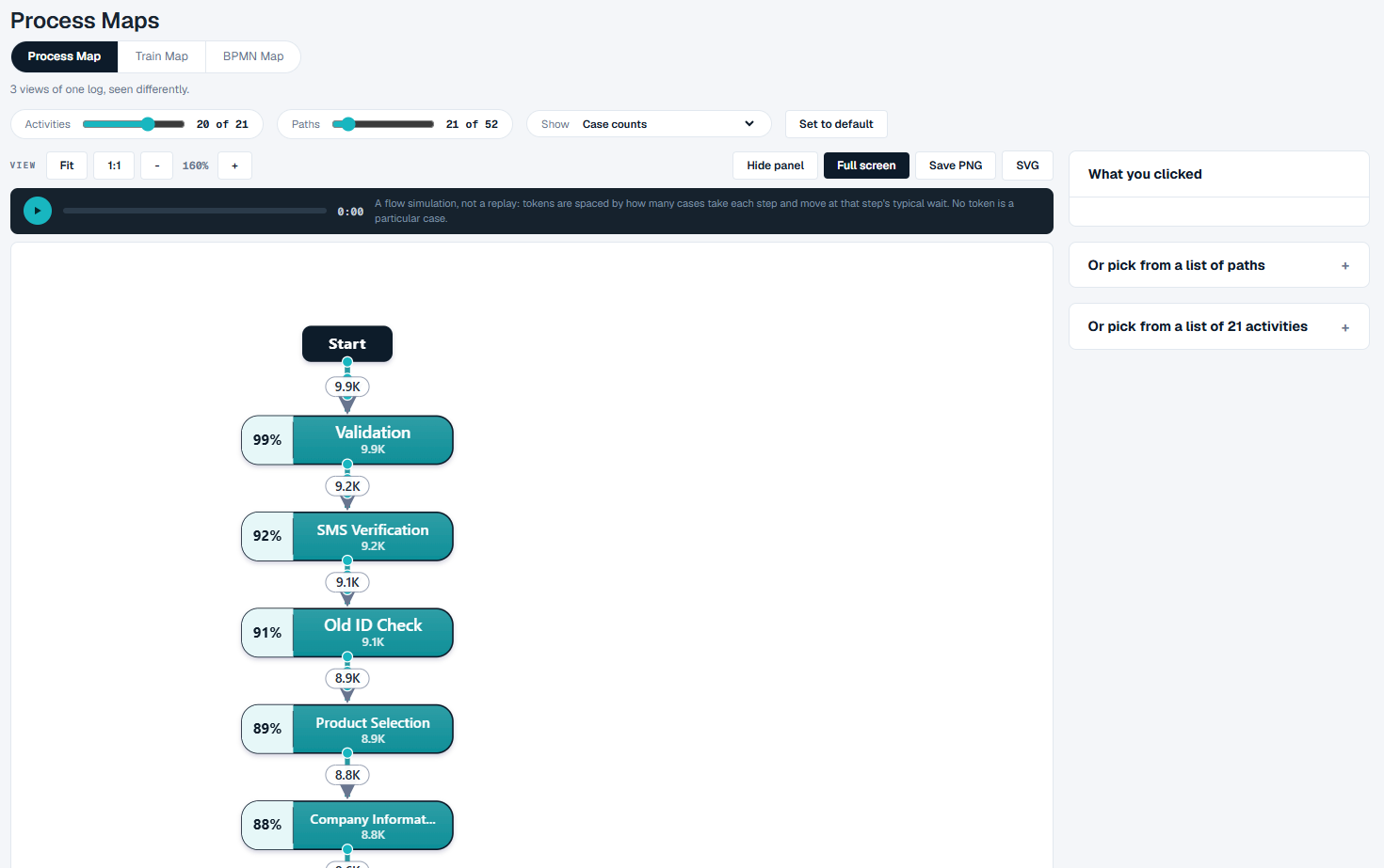
The Process Map
How to read it
- The switch - Process Map, Train Map, BPMN Map. The line under it reminds you that all three are views of one log.
- Case notion - shown above the controls only when your log holds more than one type of object, such as orders and invoices. It picks which object type counts as a case, and the map is redrawn for it. The type marked (default) is the one the event log you selected on Data is read by, and choosing it takes the map back to that log. See Choosing What a Case Is.
- The controls row:
- Activities - how many activities are drawn, for example "20 of 21". The map always draws the main path; the slider adds the less common activities.
- Paths - how many connections between activities are drawn, for example "21 of 52". The slider adds the rarer ones.
- Show - what the numbers on the map mean. Case counts puts the number of cases on each step and each path. Waiting time adds the typical wait to each path. If your log has number columns, the list also offers to size the map by one of them: its total, average, highest or lowest. Once a rule is written on Rules, the list also offers Shade by a conformance rule, with one entry for each rule the Conformance screen counts. Each activity is then shaded by the share of the cases through it that break the rule somewhere in their life - not by where the rule was broken, because a rule is a statement about a whole case. What the shading shows is where those cases gather: if the map has one red step and the rest are pale, that is where to look.
- Set to default - puts the sliders back where the map opened. The opening position is worked out from your log.
- The map itself. Each box is an activity. The percentage on its left is the share of cases that reach it, and the number under its name is how many cases do. Each arrow is a path from one activity to the next, labelled with the number of cases that took it. The map runs from Start at the top to End at the bottom.
- The legend, under the map, tells the four kinds of line apart: main flow, side flow, rework and repeat.
- The coverage line, under the legend, says how much of the log the drawing holds - for example "20 of 21 activities, 99.9% of the events - 21 of 52 paths, 98.3% of the moves between activities". When the sliders hide something, this line tells you how much.

The panel on the right has three parts:
- What you clicked - empty until you click a step or a path on the map.
- Or pick from a list of paths - the commonest paths through the process, with how many cases took each, their share and their number of steps.
- Or pick from a list of activities - every activity with its number of events.
The view bar
Above the map:
| Button | What it does |
|---|---|
| Fit | Shows the whole map, however large. |
| 1:1 | Shows the map at full size. |
| - and + | Zoom out and in. The current zoom is shown between them. |
| Hide panel | Gives the map the whole width. |
| Full screen | Fills the screen with the map. Press Escape to leave. |
| Save PNG | Saves the whole map as an image, ready to paste into a slide or an email. |
| SVG | Saves the whole map as an SVG file, which stays sharp at any size. |
Both saves take the whole map, not just the part on screen.
Under the view bar is a play button. It runs a flow animation over the map: tokens are spaced by how many cases take each step, and move at that step's typical wait. It is a simulation of the flow, not a replay - no token is a particular case.
What you can do
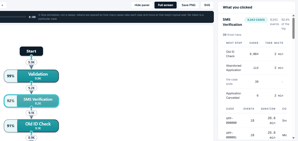
See what happens at one step
- Click an activity on the map.
- What you clicked shows how many cases reach it, its events and its share of the log, how many cases finish there, and a table of the Next step each case took, with how many Cases took it and how long they Then waits.
- Below that is a list of the cases that went through the step. Click Filter the whole map to these cases to redraw the map for those cases only.
See how long one path takes
- Click the number on an arrow.
- What you clicked shows how many times the path was taken and by how many cases, and the wait on it: Median wait, Mean, 95th percentile, Worst, and All of it added up.
- Below that are the slowest cases on this path.
When the median and the 95th percentile are far apart, the step is usually quick and sometimes is not. That gap is often the thing worth chasing.
Look at only the cases that took one path
- Open Or pick from a list of paths.
- Click a row. The map redraws for the cases that took that path.
- A chip above the controls says what the map is showing, for example Showing only Variant #2. Click the x on the chip to go back to all cases.
Clicking an activity in Or pick from a list of activities works the same way: the map redraws for the cases that contain that activity.
While a filter is on, Take it to at the right of the chip opens Variants or Performance with the same filter.
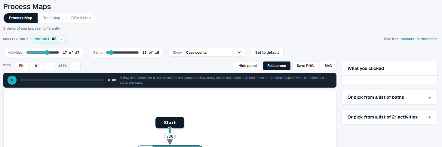
Simplify a busy map
- Drag Activities to the left to drop the rarer activities.
- Drag Paths to the left to drop the rarer connections.
- Click Set to default to go back.
The Train Map
The Train Map draws each kind of object in your data - an order, an invoice, a delivery - as a line of its own, like lines on a transit map. Each activity is a station. Where the lines meet, objects of different kinds take part in the same step, and the map measures the wait between them.
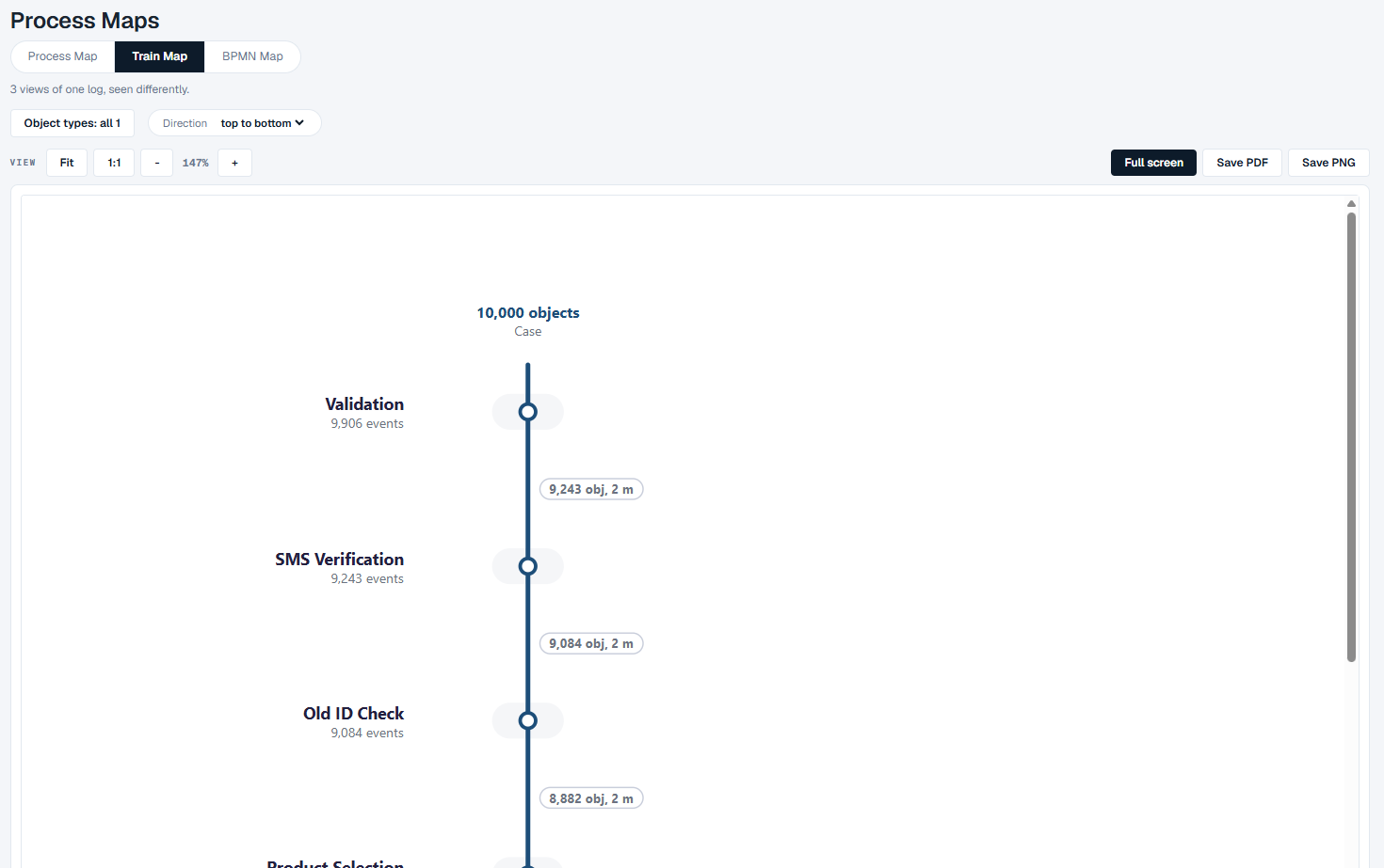
How to read it
- Object types - which kinds of object are drawn. Click it, tick the ones you want, and click Draw. All and None tick or clear them all.
- Direction - top to bottom or left to right.
- The map. Each station shows the activity and its number of events. The label on each stretch of line shows how many objects made that step and their median time. The key under the map explains the rest.
- Handoffs between object types and Measured findings - panels under the map that list the waits between kinds of object, and anything on the log that stands out. When there is nothing to report, each panel says so.
- What this map is not showing - what the drawing left out.
The view bar has Fit, 1:1, zoom and Full screen, as on the Process Map. Save PDF and Save PNG save the whole map together with the panels under it.
Good to know
- When your data has only one kind of object, the Train Map is a single line, and the screen says there is no handoff between types to show. The Process Map shows the same flow with case counts on it.
- A filter you set on the Process Map is not applied here. The Train Map says so at the top and offers Back to the classic map.
The BPMN Map
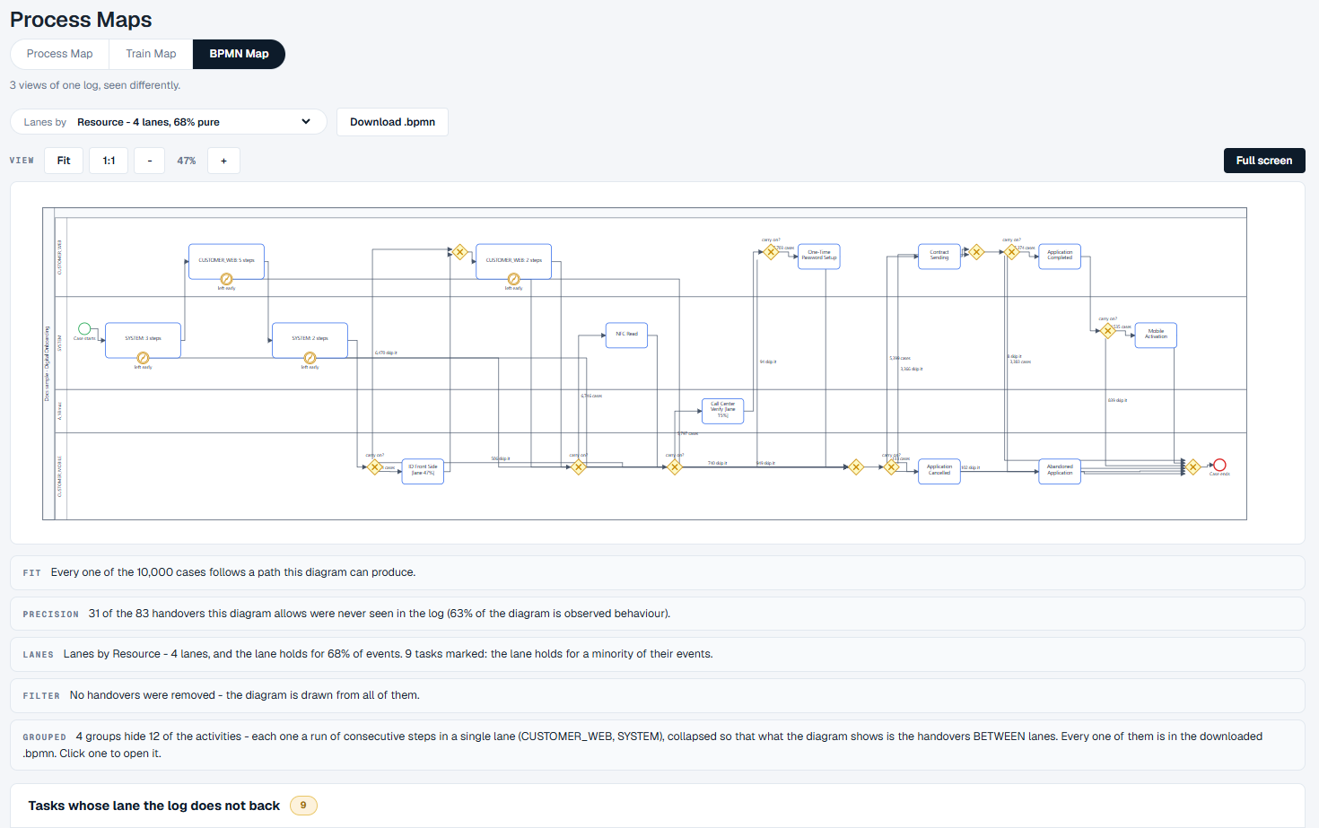
The BPMN Map draws the process as a BPMN diagram, with swim lanes, that you can download and open in a BPMN modelling tool.
How to read it
- Lanes by - which column of your log decides the swim lanes. Each choice says how many lanes it makes and how "pure" they are: the share of events that fall in the lane they are drawn in. Columns that would make only a single lane say so.
- Download .bpmn - saves the diagram as a
.bpmnfile. - The diagram. It opens fitted to the width, so you see its whole shape; use + or Full screen to read the labels. Runs of steps in the same lane are grouped into one box, such as "3 steps", so that what you see is the handovers between lanes.
- The statements under the diagram say how far to trust it:
- FIT - how many cases follow a path the diagram can produce.
- PRECISION - how many of the handovers the diagram allows were never seen in the log.
- LANES - how much of the log the lanes hold.
- FILTER - whether any rare handovers were left out.
- GROUPED - which steps are grouped, and in which lanes.
- Tasks whose lane the log does not back - activities that happen in several lanes, where the lane they are drawn in holds fewer than half of their events.
What you can do
- To change the lanes, choose another column in Lanes by.
- To see the steps inside a group, click the group. It opens in place; click it again to close it. The statements under the diagram name the steps it holds.
- To take the diagram into another tool, click Download .bpmn. The file holds every step, including the grouped ones.
Good to know
- The BPMN Map is worked out from every case in the log. A filter you set on the Process Map is not applied here, and the screen says so.
- A lane is where most of an activity's events happened, not a rule about who does it. Check Tasks whose lane the log does not back before you read a lane as a responsibility.
Good to know
- All three views read the event log in use, shown in the top bar.
- Large logs can take a few seconds to draw. The screen shows what it is working on while you wait.
- To look at the paths themselves rather than the map, open Variants.